
REELSTAY . SHIPPED 2026
Redefining the video-first travel and booking experience for ReelStay
OVERVIEW
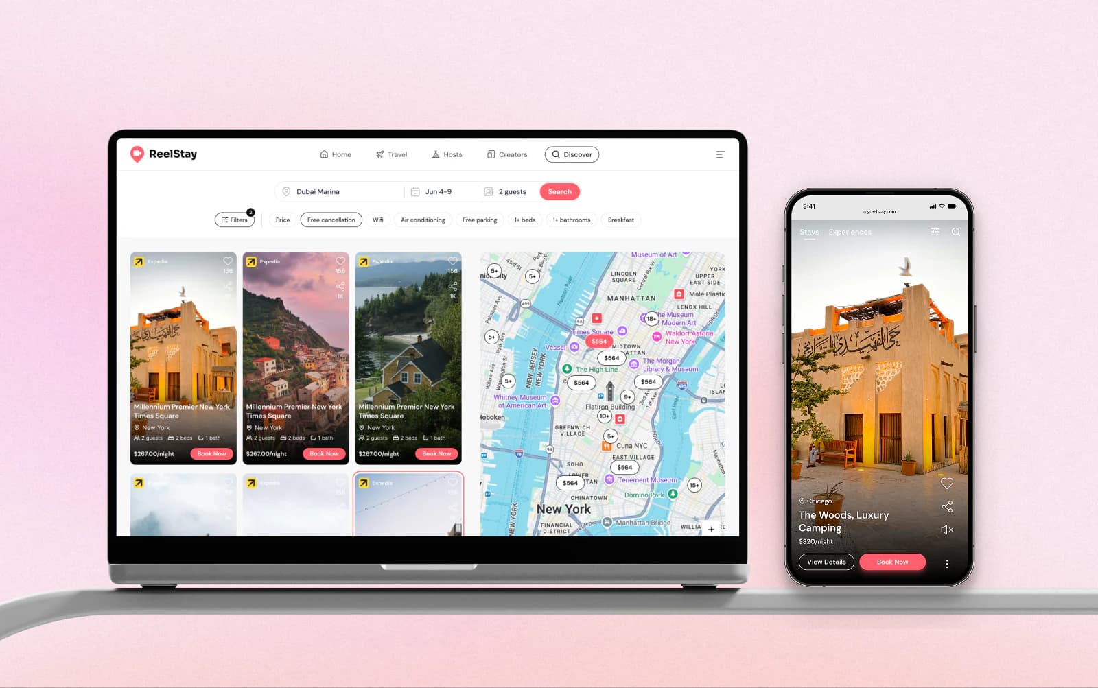
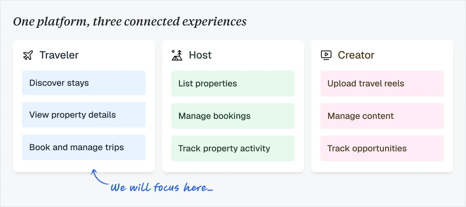
ReelStay is a video-first travel platform for travelers, hosts, and creators.
It brings a TikTok-style, video-first experience to travel booking, connecting short travel videos with Expedia properties and direct listings by ReelStay, hosts and creators.
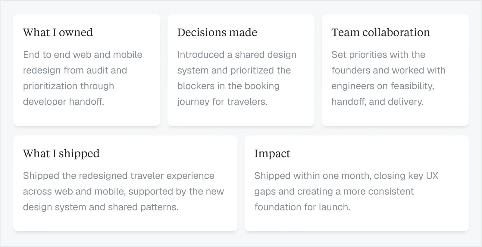
I worked with two founders and two engineers to redesign the product across web and mobile. This case study focuses on the traveler journey from discovery to checkout..
MY ROLE & IMPACT
THE PROBLEM
The MVP proved the concept, but the traveler journey broke down between discovery and checkout.
Property pages lacked key booking details, and checkout was confined to pop-up modals. Inconsistent patterns also made the product harder to build and maintain.
THE SOLUTION
Make it easier for travelers to move from finding a stay to completing a booking.
I redesigned discovery, property details, room selection, and checkout across web and mobile, while creating reusable patterns for the engineers to speed up the development process with more consistency.
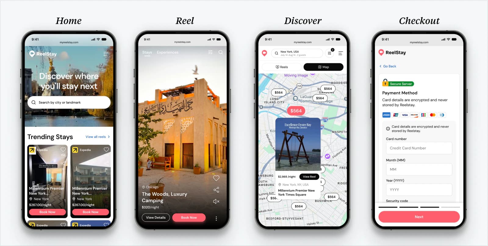
A look at the shipped journey
Home page
Discover
Property details
TRAVEL FLOW AUDIT
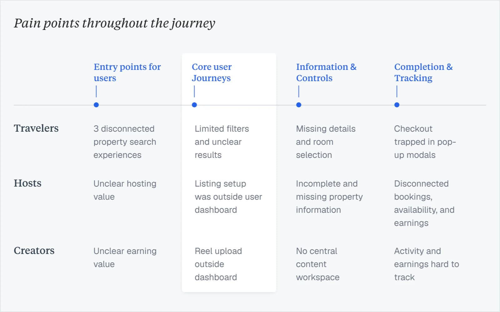
I reviewed the full experience from the perspective of travelers.
I documented missing actions, dead ends, unclear messaging, accessibility gaps, and inconsistent patterns, then organized the findings by journey stage and priority.
The issues went beyond individual screens. Without shared design rules, familiar actions behaved differently while engineers rebuilt the same features differently across the product, creating friction for travelers and slowing the development.
DESIGN SYSTEM
Creating Consistency Across ReelStay
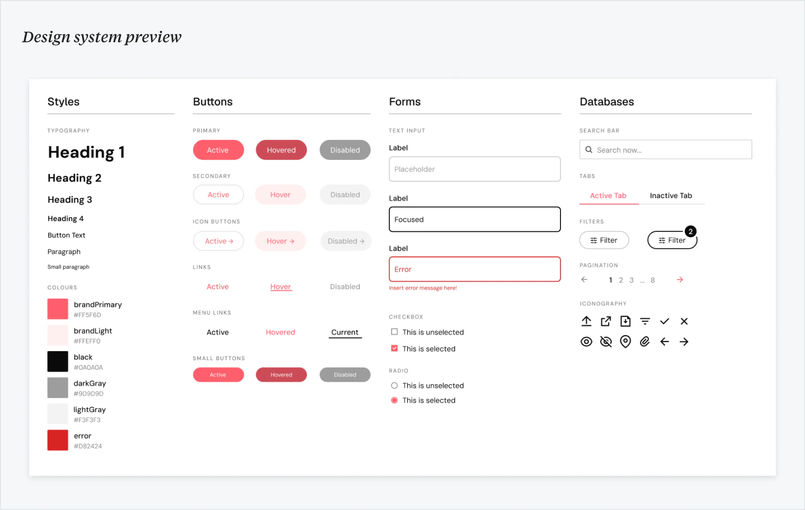
After identifying the pain points of user’s journey, I started off with a design system to standardize the typography, colors, buttons, forms, filters, and interaction states used across ReelStay. This gave engineers a shared reference instead of rebuilding the one-off solutions.
HOME PAGE
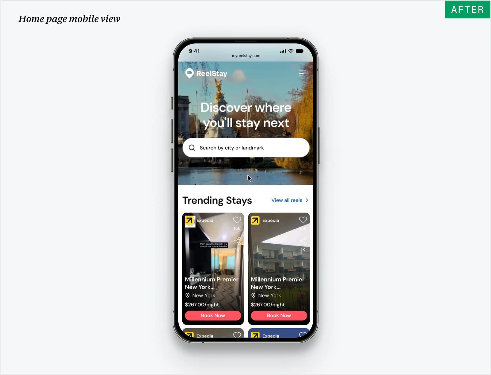
A clear starting point for travelers to search their next destination...
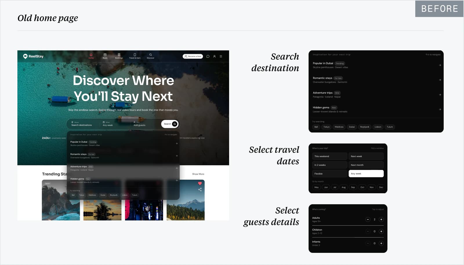
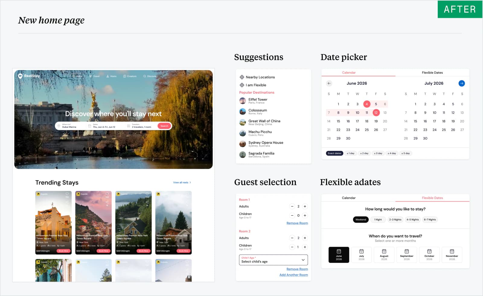
The original home page buried search inside a crowded, low-contrast hero. I simplified the layout, removed the competing typeface, and reworked destination, date, and guest selection for desktop and mobile.
DISCOVER
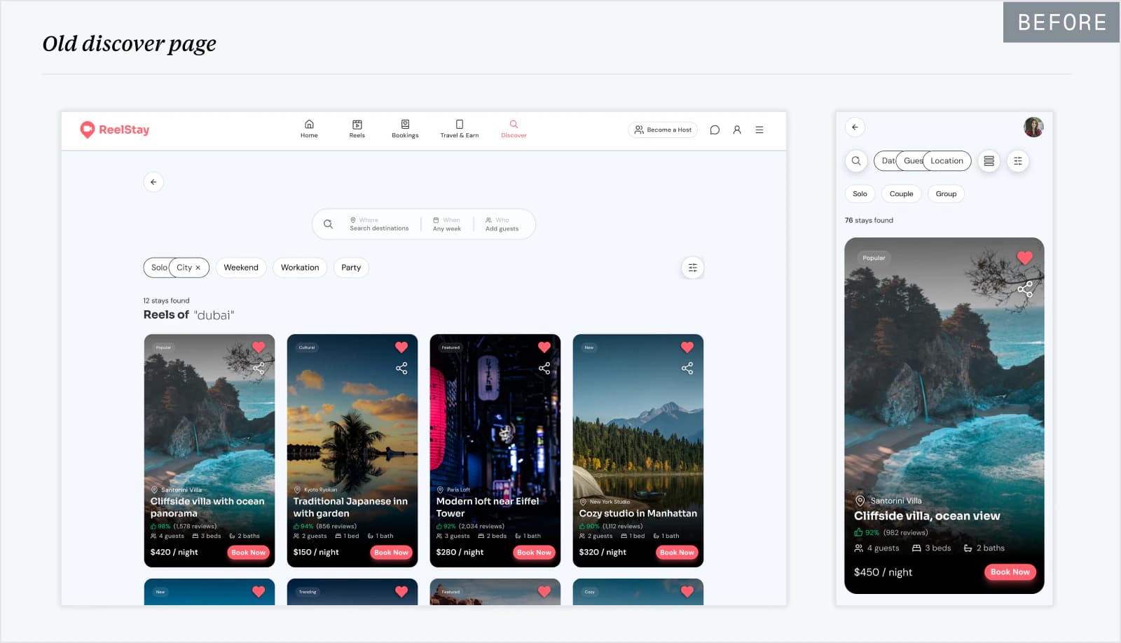
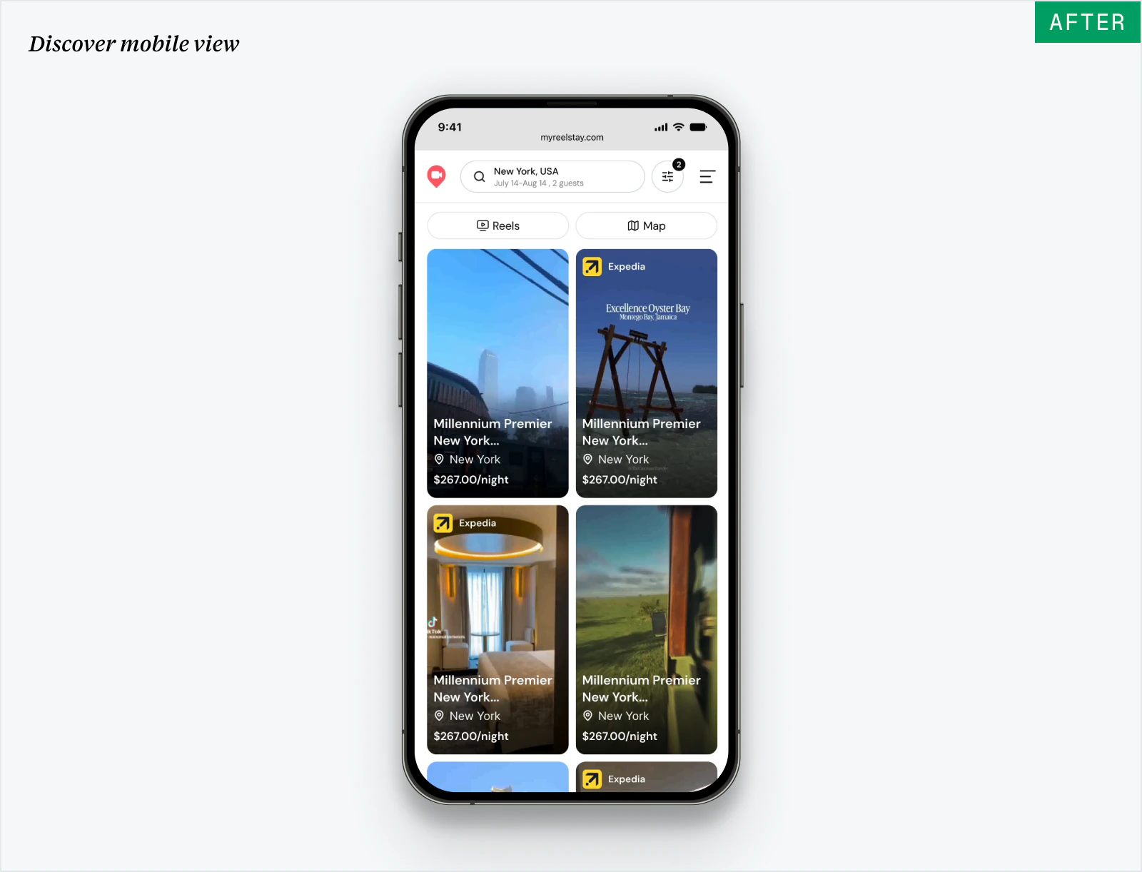
The original Discover page felt more like a feed, with limited search and filtering options...
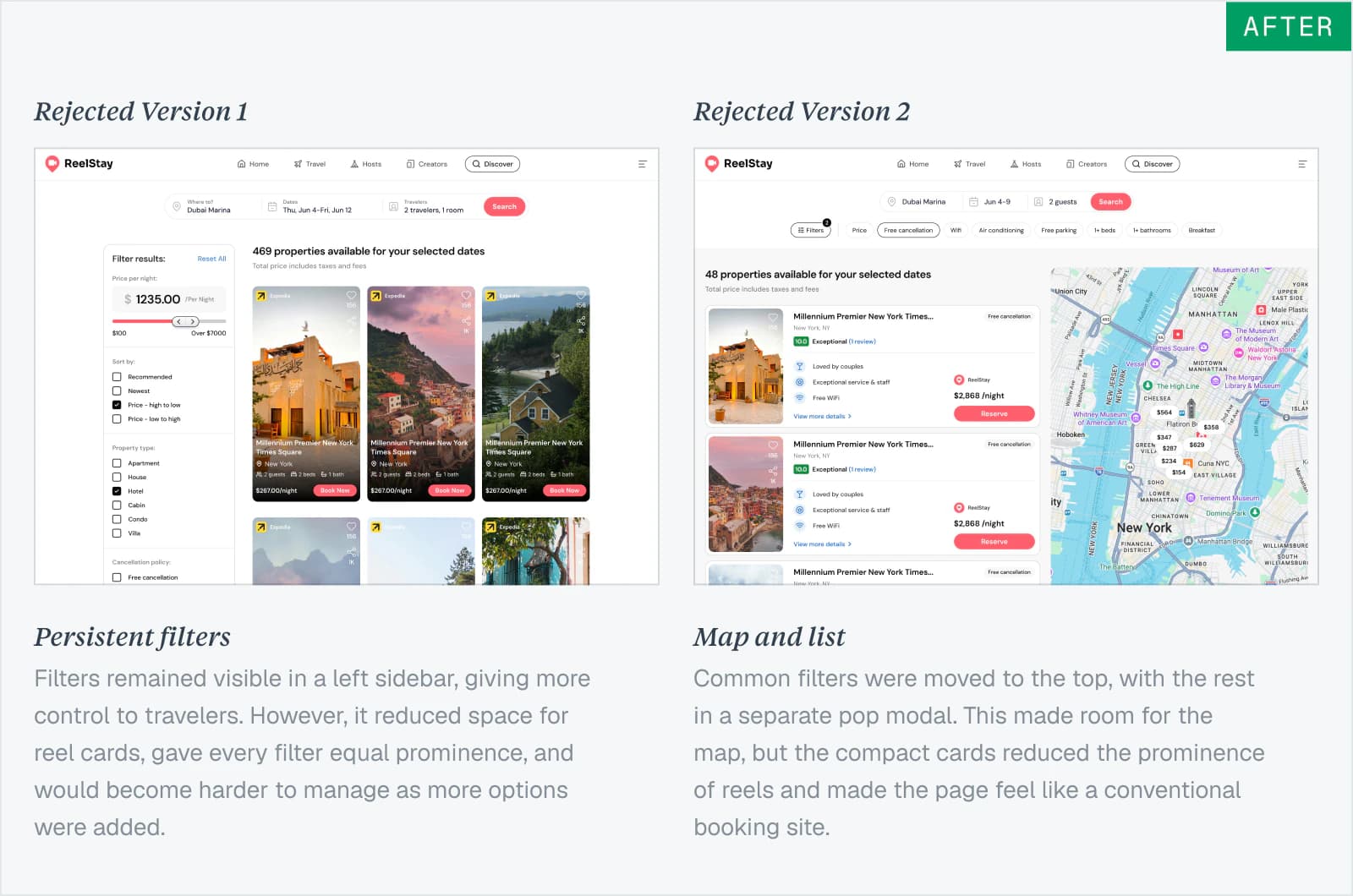
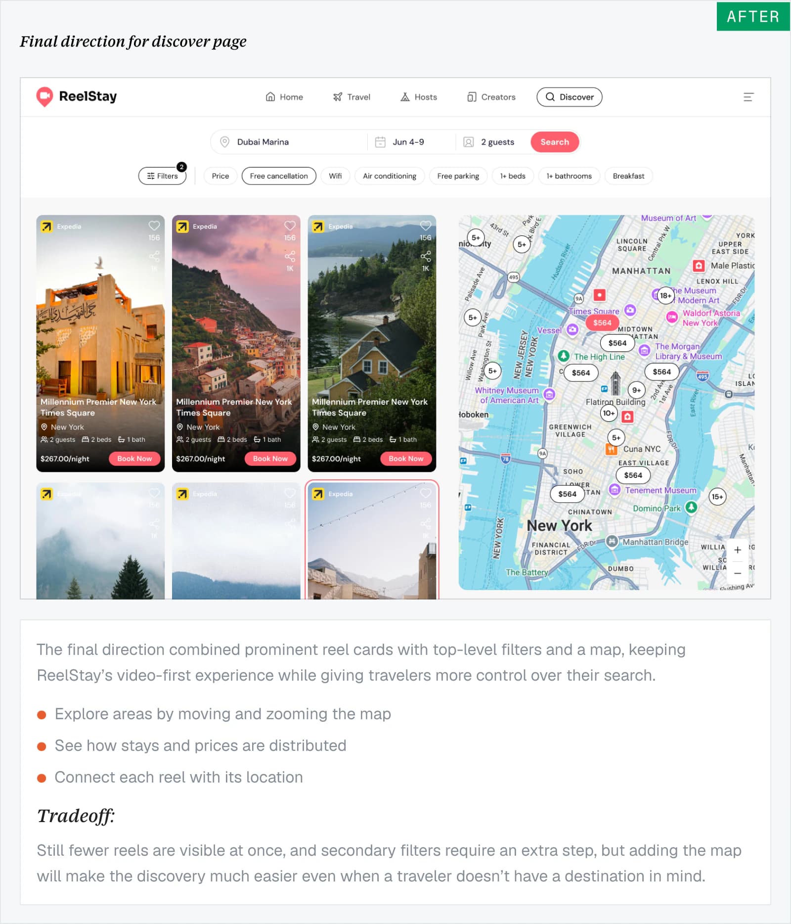
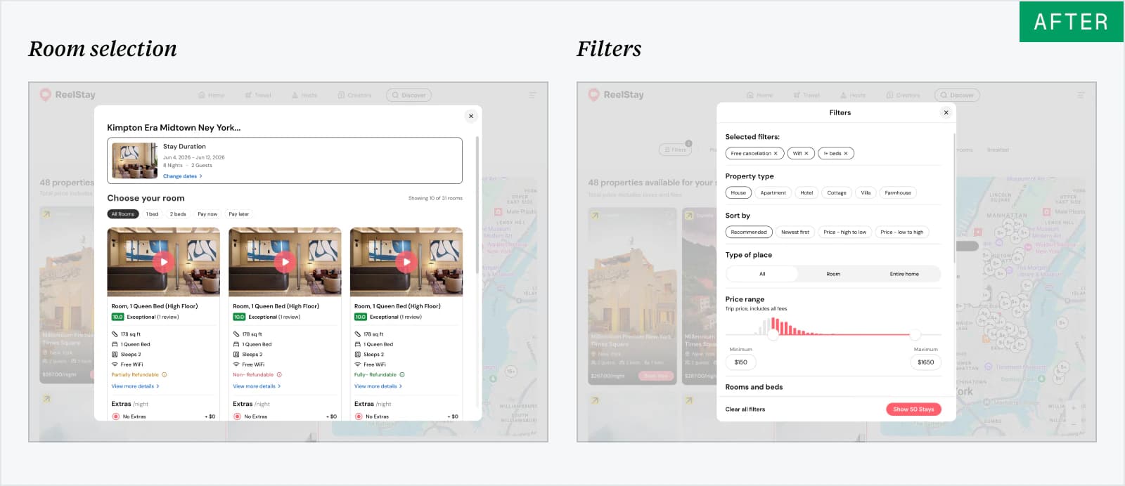
I explored different ideas to redesigned it around clearer search results, filters, improved usability and engagement, making it easier to move from casual browsing to finding the right stay.
PROPERTY DETAILS
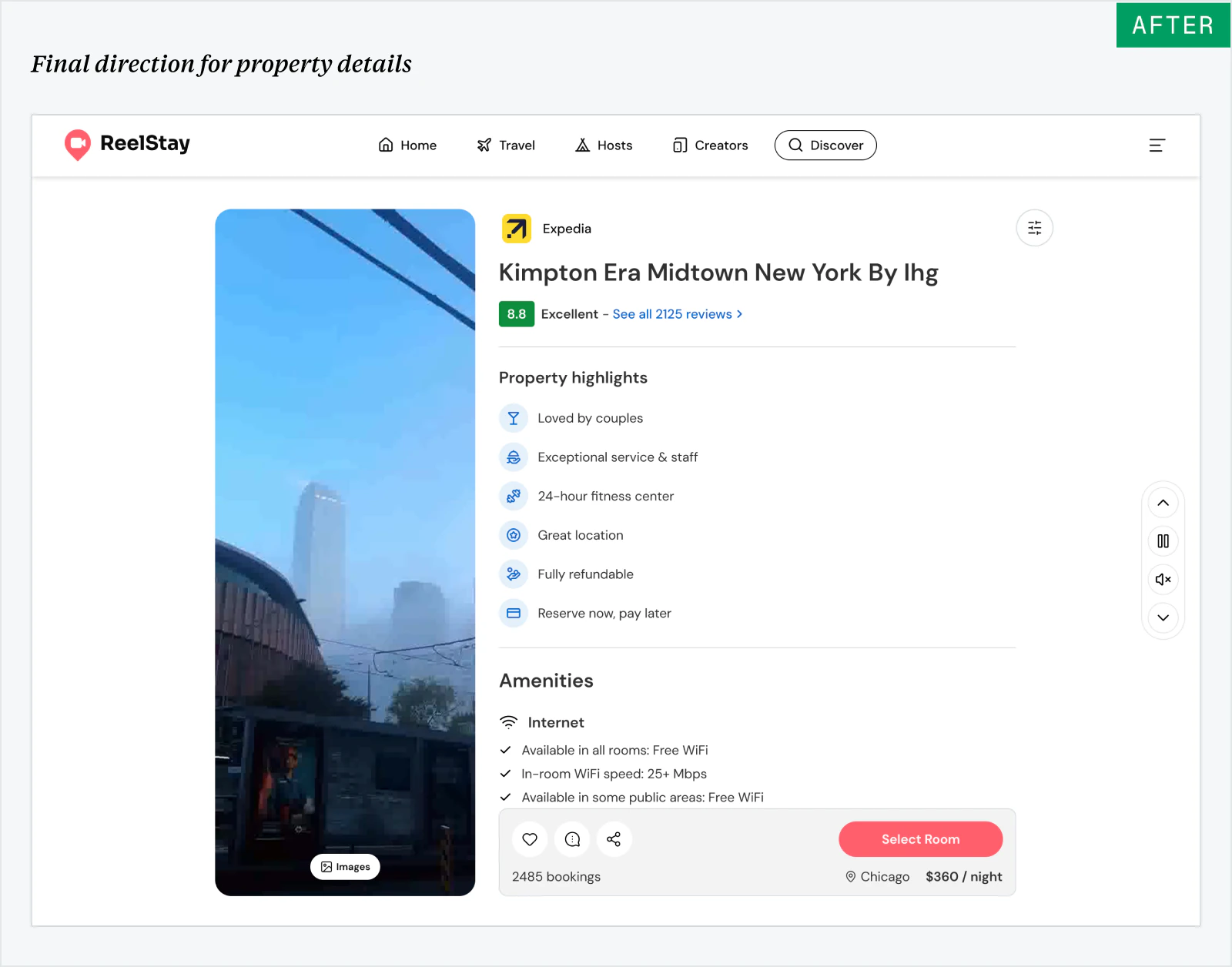
Making the property details easier to review
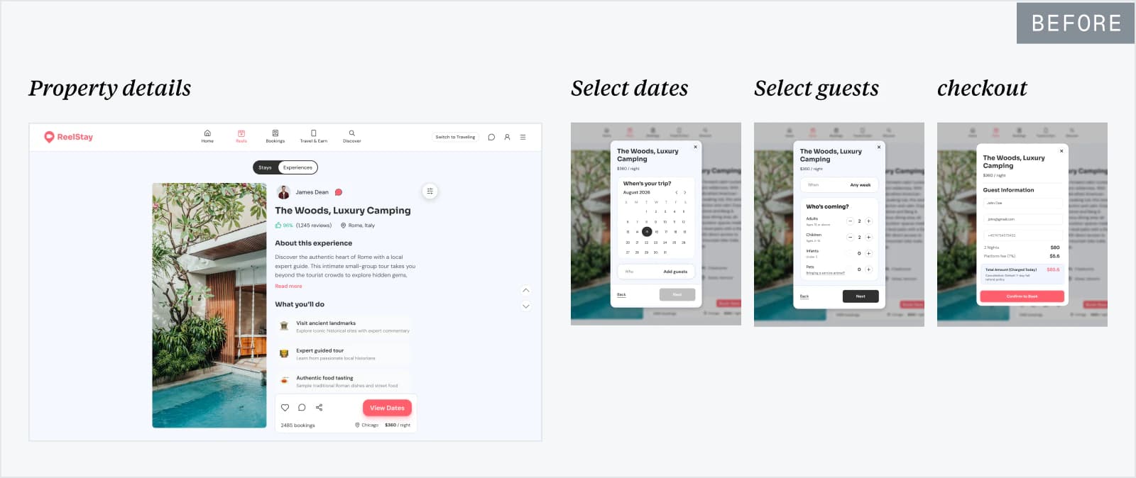
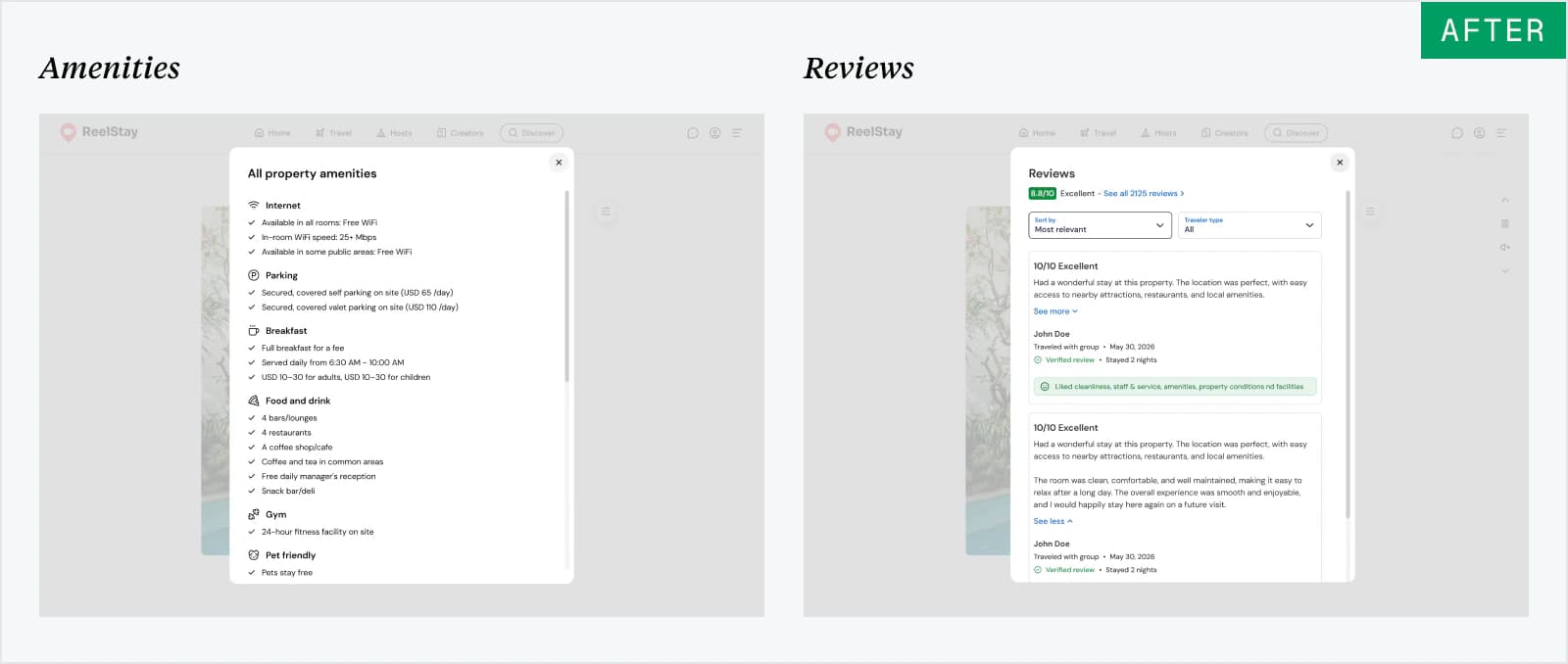
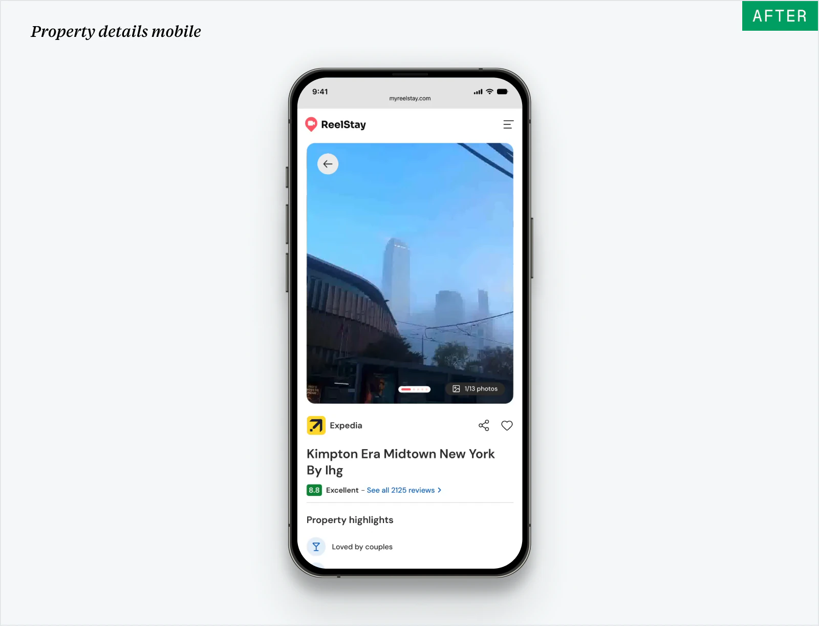
The original reel-based page could not accommodate Expedia’s property and room content. There was no way for travelers to select the rooms and checkout was built ont the same page as pop-up modals.
I reorganized highlights, amenities, reviews, and booking details, added the room selection feature into the page so travelers could compare options without losing context and moved the checkout to its own separate page.
CHECKOUT
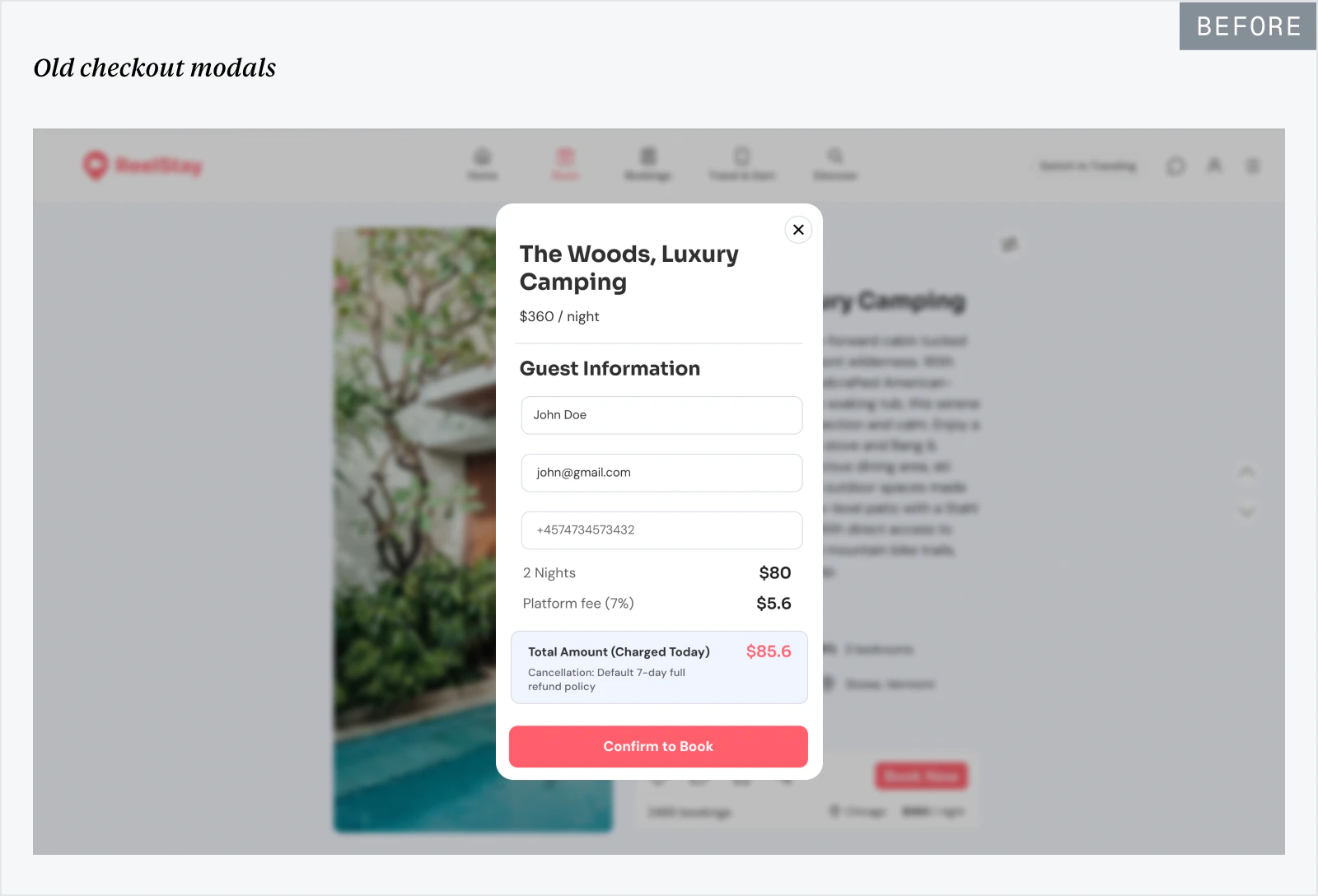
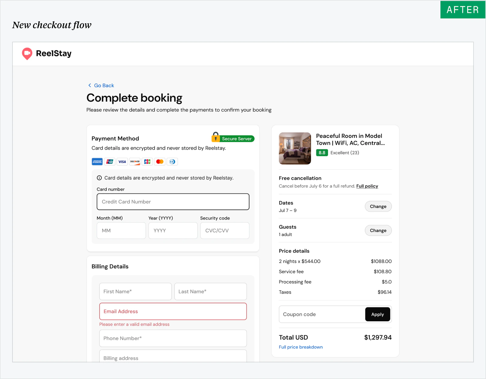
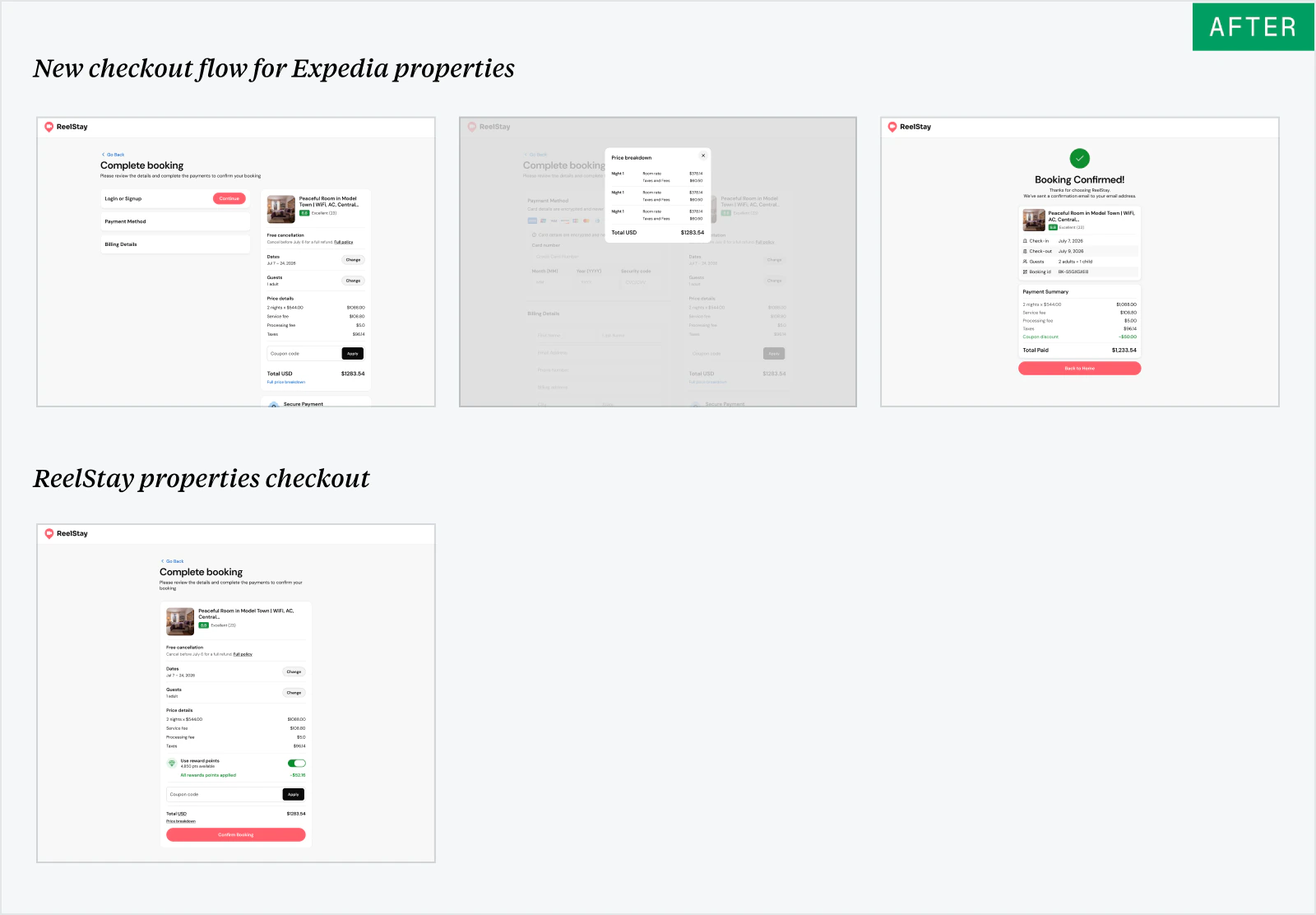
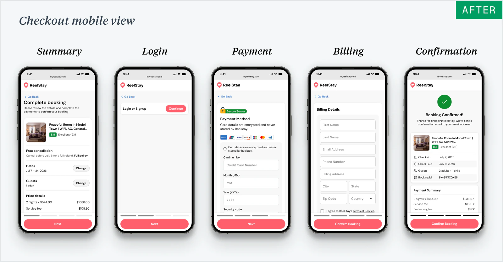
Moving checkout out of pop-up modals
ReelStay and Expedia bookings used different modal flows that left little room for pricing, cancellation terms, and trip details. I moved both to dedicated pages with a consistent structure for review, payment, and confirmation.
OUTCOME
Fully shipped the new web and mobile experience for travelers within one month.
Within one month, I redesigned ReelStay’s web and mobile traveler journey from discovery to checkout. The founders approved the new direction, giving the team one agreed experience to move forward with.
- Established a shared direction for the traveler experience across web and mobile.
- Helped engineering move away from one-off UI decisions with reusable patterns for core booking flows.
- Resolved key booking blockers, including room selection and separate checkout experiences for ReelStay and Expedia properties.
Although the work was shipped, ReelStay had not launched publicly at the time of writing, so user and business results are not yet available.
REFLECTION
What I learned
Aligning early with the team
Working closely with founders and engineers helped me understand technical constraints, catch blockers early, and align on ideas quickly so we could iterate faster.
Taking ownership in ambiguity
With no defined redesign roadmap, I mapped the experience, identified the highest-priority gaps, and turned them into clear work the team could act on.