
BEENVERIFIED . SHIPPED 2022
Redesigning the BeenVerified reports to lower the early cancellation rate by 4.5%
OVERVIEW
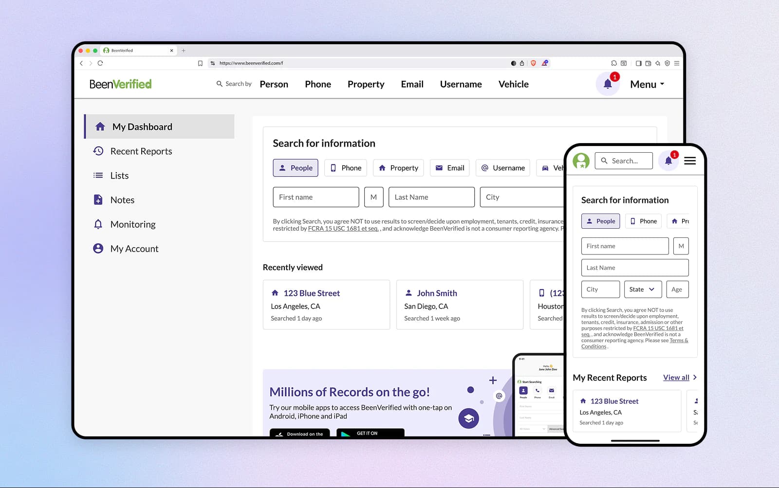
As BeenVerified added more report types and data, the experience became harder to use.
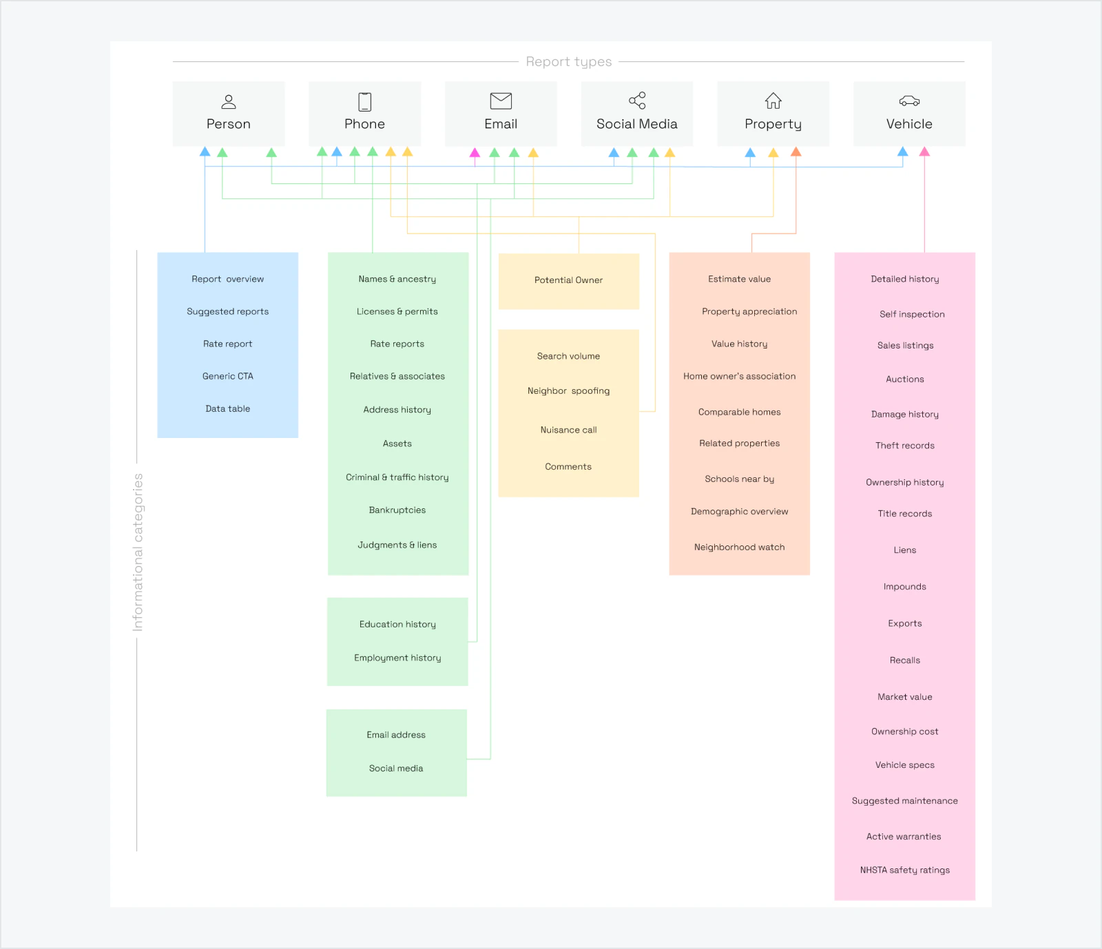
Related information appeared in different places on all 6 report types, navigation changed between reports, and users had to relearn where to look each time contributing to more support requests and early cancellations.
Support requests and early cancellations increased, so we decided to improve the report experience before introducing more reports and data.
Project Constraints
- Existing customers were familiar with the old experience.
- Reports were the company’s main revenue generating product.
- The redesign could not interrupt core report functionality.
- Different reports needed to support different data.
- Everything needed to work across responsive web surfaces.
DEFINITION OF SUCCESS
Success meant helping users find, understand, save, and return to useful information more easily, while lowering early cancellations and creating a reliable base for future reports.
SOLUTION
I redesigned BeenVerified’s dashboard and six report types around a shared information structure, clearer navigation and reusable components.
The new experience made important information easier to find, added better ways to save and monitor findings, and gave the team a consistent structure for adding future reports and data.
OUTCOMES
4.5% reductionin early cancellation rate
33% increasein feature usage
+1:20 increasein avg time on page
$3.7M liftin projected revenue
BRANDS IMPACTED BY THE REDESIGN

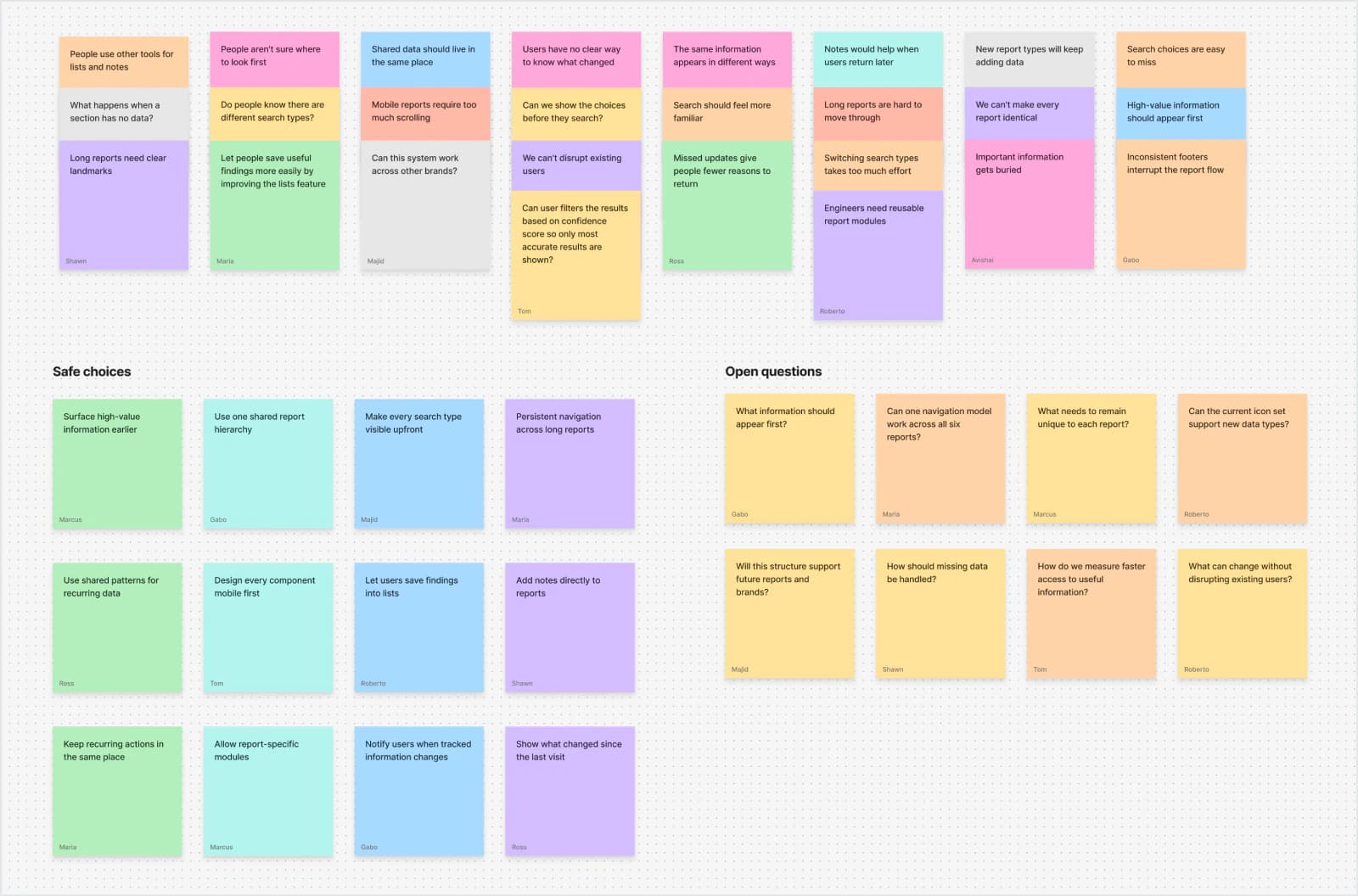
USER INTERVIEWS
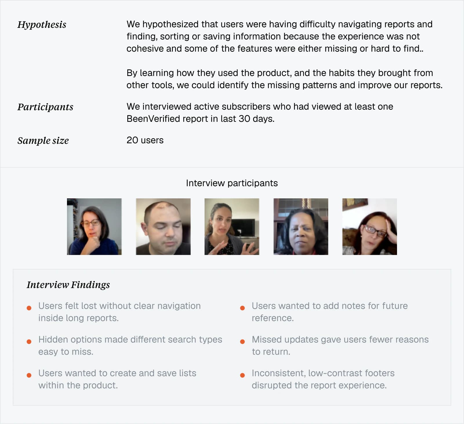
I led product design for the project, partnering with product and research to interview active subscribers.
Goal was to understand what they looked for, how they moved through reports and where they got stuck. The findings showed which information mattered most and where the report structure was getting in the way.
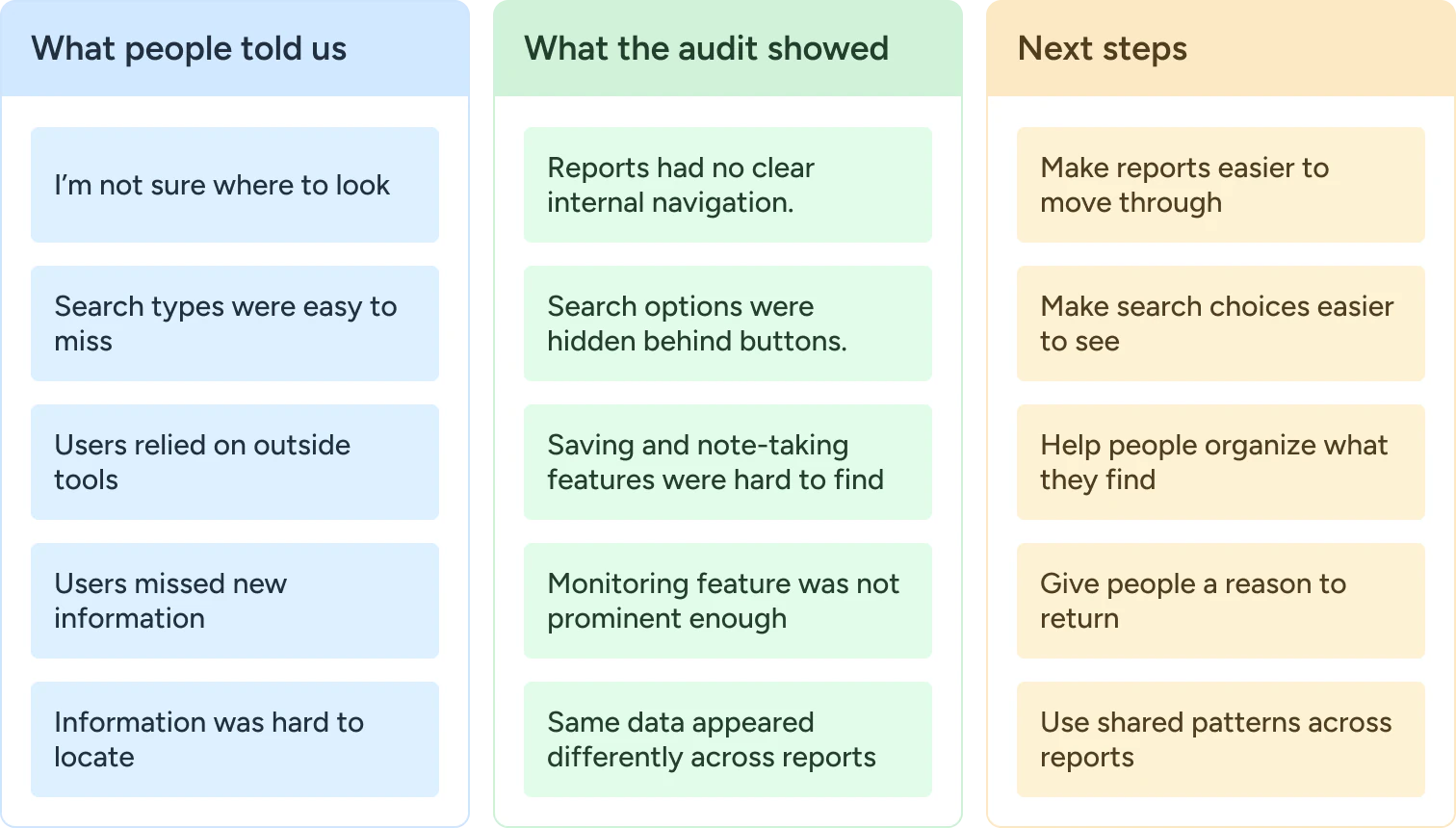
PRODUCT AUDIT
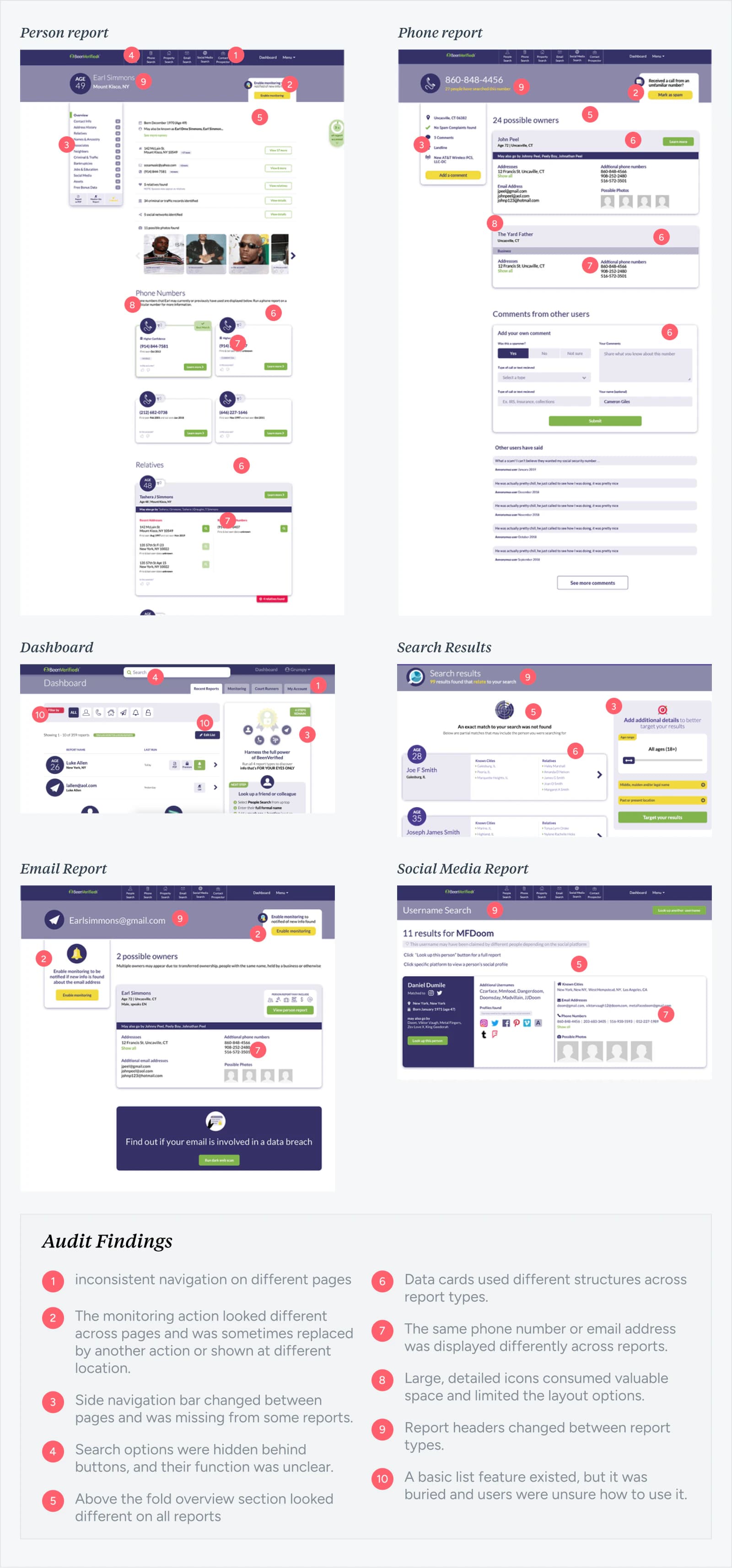
Guided by the interviews, I audited the journey from search to report across all six report types.
The review showed that inconsistent information, navigation and components affected the entire product and not just a few screens.
RESEARCH SUMMARY
The interviews showed where users struggled, while the audit confirmed those problems across the product.
Together, they helped us prioritize five areas that improved access to information and worked within existing technical constraints.
DESIGN SYSTEM
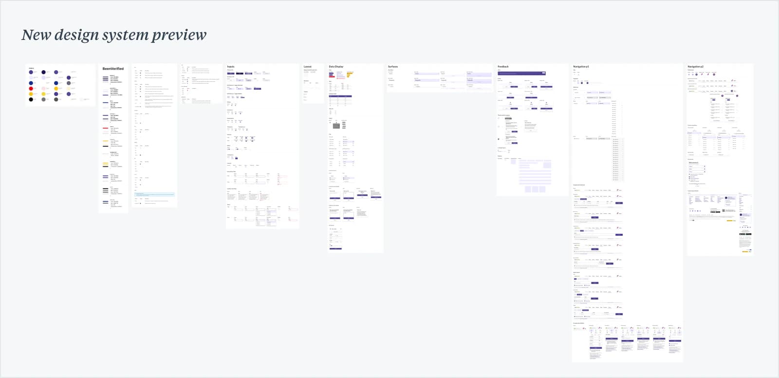
The existing design system was not built to support different report types.
It lacked clear guidance for color, typography and data, while the detailed Chameleon icons were difficult to use at smaller sizes, I documented how cards, inputs, data tables, feedback and navigation should work across desktop and mobile.
BUILDING THE FOUNDATION
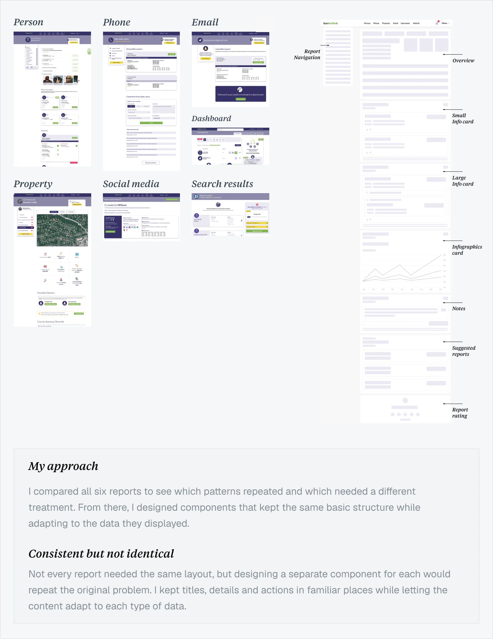
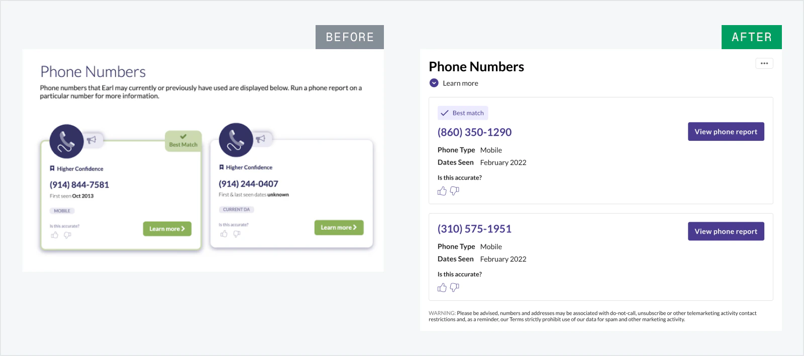
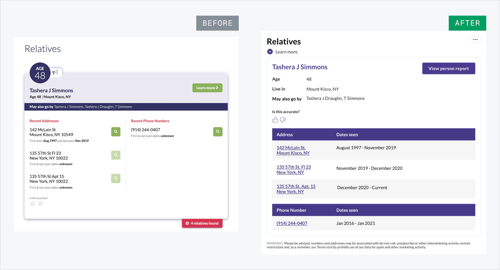
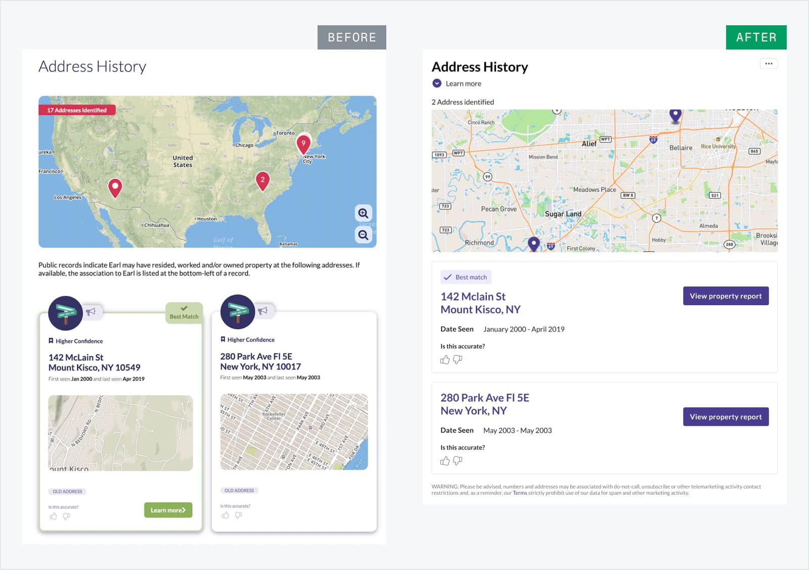
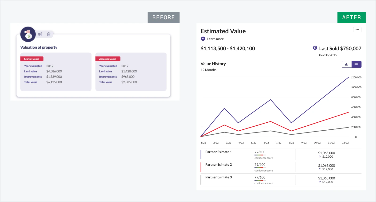
I mapped and created shared components for information that appeared across multiple reports.
I kept titles, details and actions in familiar places while allowing each layout to adjust to its data. This made reports easier to scan and reduced the need to design and build each one from scratch.
DASHBOARD & NAVIGATION
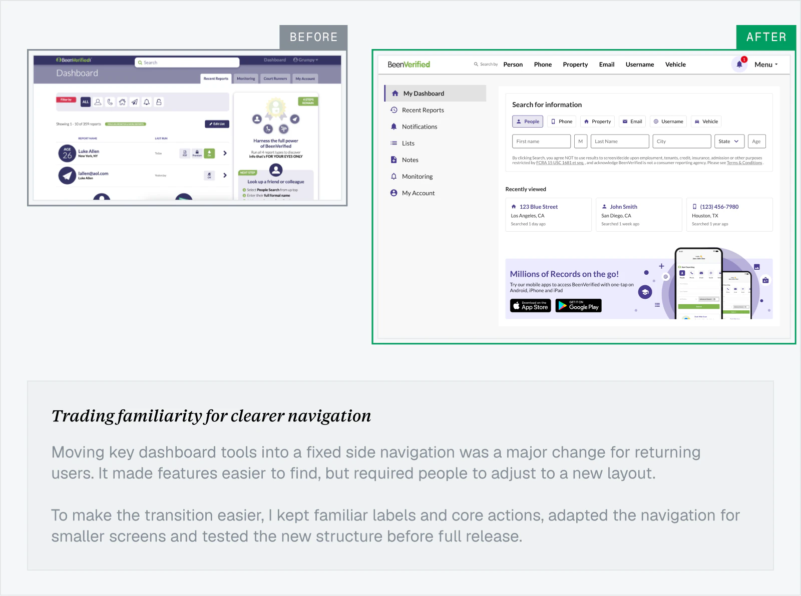
Dashboard tools were scattered across tabs and buttons, making search options, lists, notes and monitoring easy to miss.
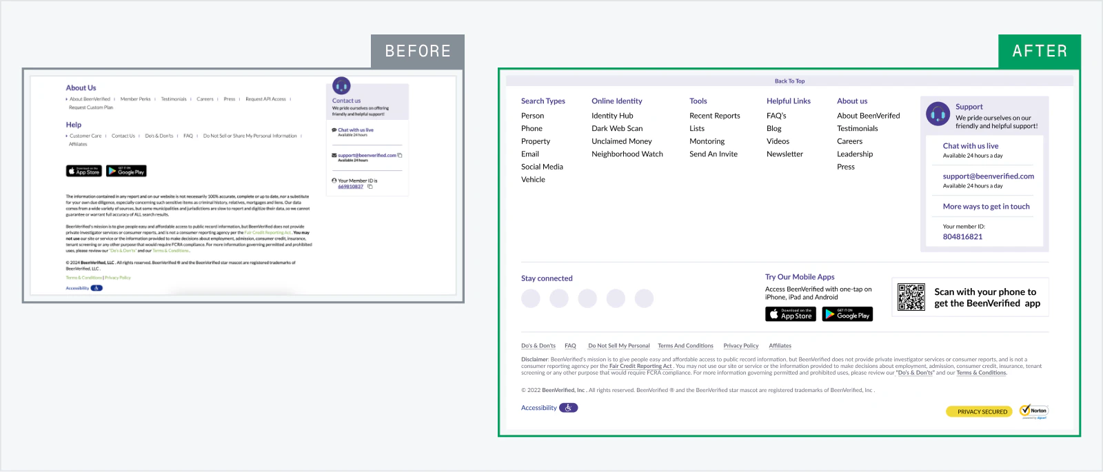
I brought them into a side navigation and made search types visible at the top. I also simplified the footer and improved its contrast so support links, social channels and the mobile app QR code were easier to find.
REPORT NAVIGATION
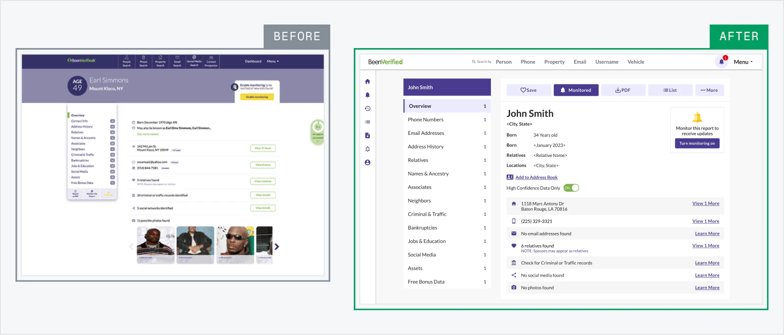
The old report page was a dead end, forcing users to return to the dashboard to reach recent reports, monitoring, account settings and other tools.
I added a sticky menu that stayed available while scrolling, gave monitoring a consistent location across reports, and introduced a high-confidence toggle so users could focus on the most recent and reliable data.
RECENT REPORTS
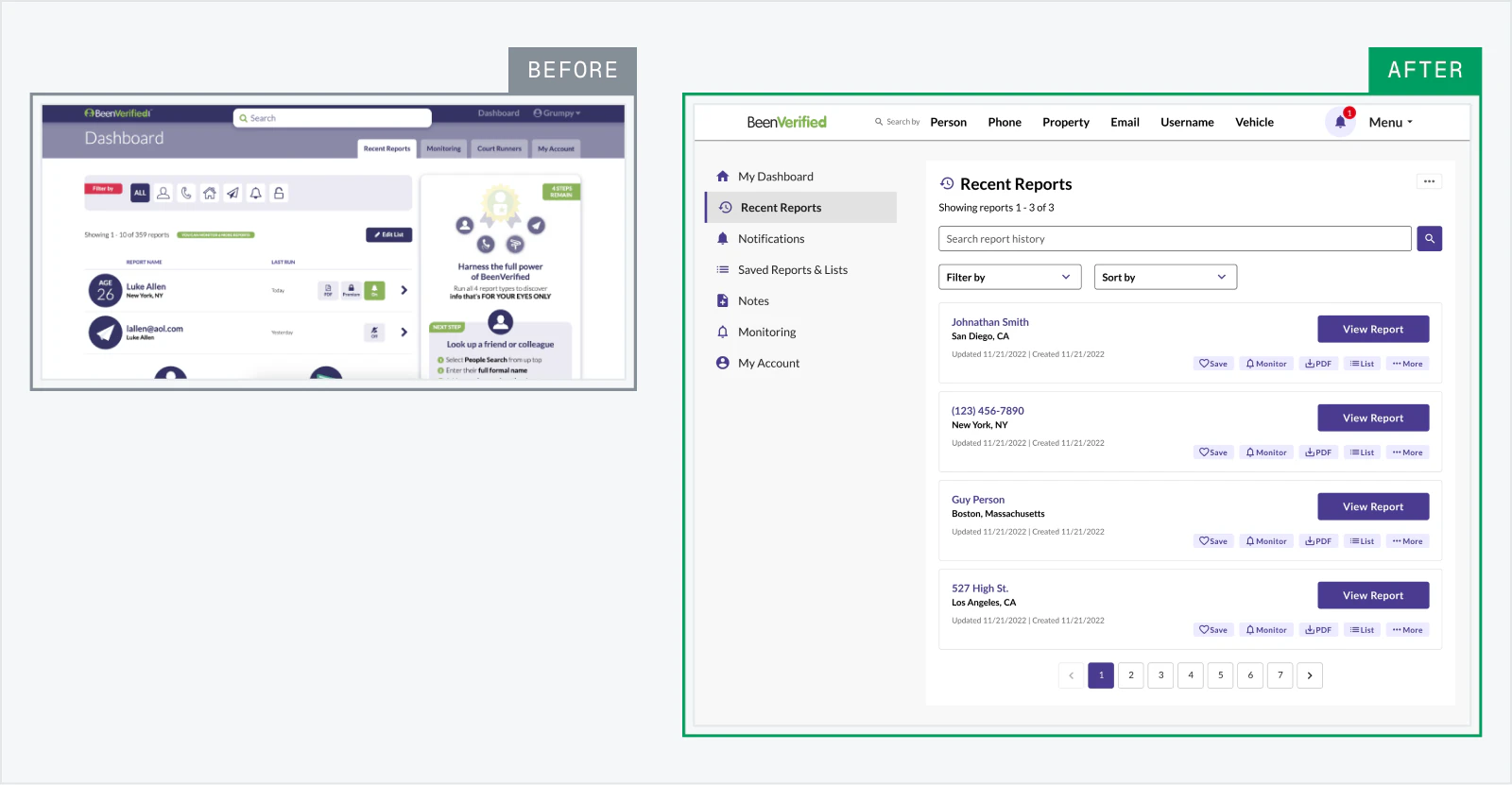
Recent reports dominated the dashboard.
I moved the full history to its own page and kept a short recent list on the dashboard, giving users a clearer place to start a new search without hiding past reports.
NOTIFICATIONS
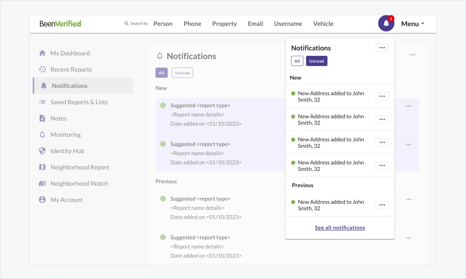
Users often missed report updates and new features.
I added notifications for monitored reports, saved searches and product announcements so they could quickly see what had changed.
LISTS & NOTES
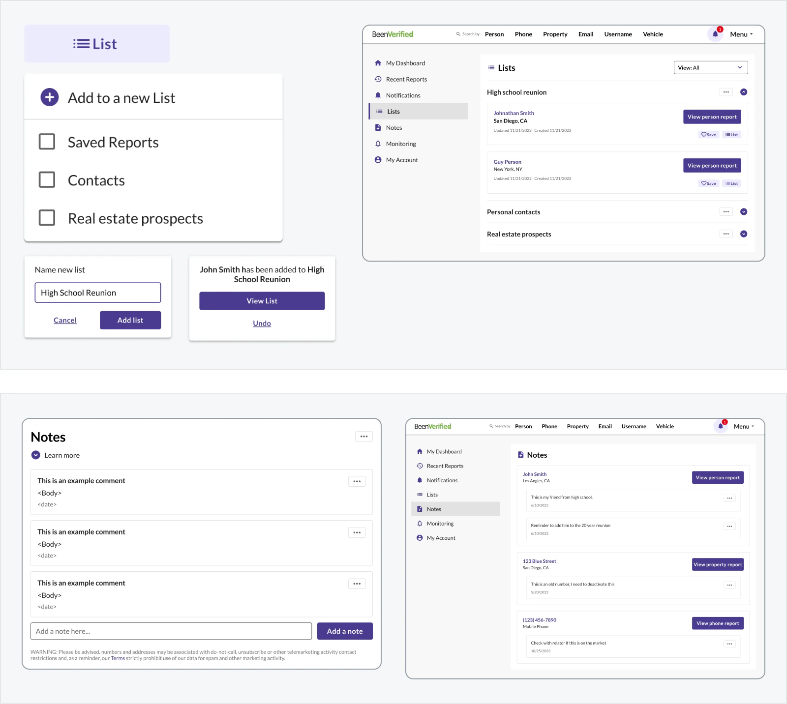
Users were saving report links and key findings into documents and spreadsheets to keep track of what they found.
I designed lists to keep related reports together and notes so they could remember why they saved them.
MONITORING
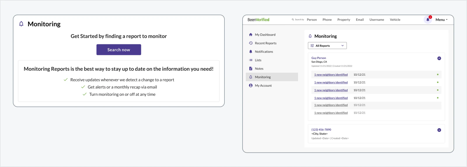
Monitoring was buried in the dashboard and gave users no clear signal when a report changed, so it often went unused.
We made it available from both the dashboard and report pages, with notifications that took users directly to new information.
VALIDATION
We released the redesign to 5% of active and divided them equally between two groups.
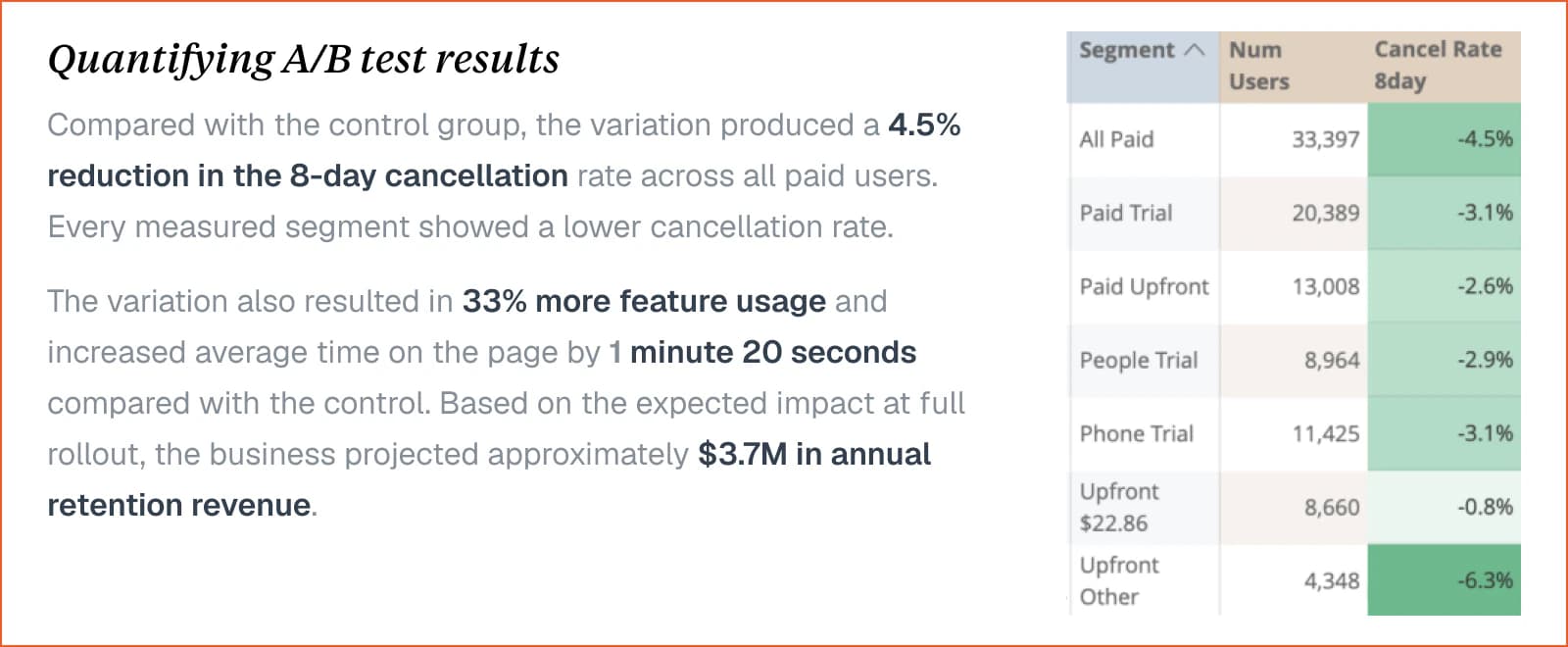
The control group continued using the old design, while 33,397 users in the variation group experienced the redesign. The A/B test ran for one month and reached statistical significance.
WHAT WE MEASURED
The primary KPI was the 8-day cancellation rate.
Measuring how many users cancelled within their first eight days. We also tracked overall interactions and average time spent on the page to understand how the redesign affected engagement.
OUTCOME & LEARNING
The redesigned experience shipped across all six report types and became the foundation for future updates and reports used by other brands.
Shared navigation, information patterns and reusable components also made it easier for design and engineering teams to add new data without rebuilding the experience each time.
The project showed that consistency did not mean making every report identical. By keeping familiar patterns in place while allowing different data to be presented in the way it needed, we improved the current experience without limiting how the product could grow.
4.5% reductionin early cancellation rate
33% increasein feature usage
+1:20 increasein avg time on page
$3.7M liftin projected revenue