
PEOPLESMART . SHIPPED 2021
Designing PeopleSmart’s B2B acquisition journey
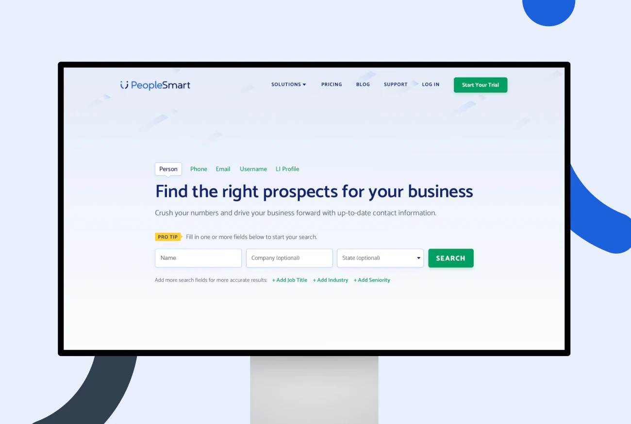
OVERVIEW
PeopleSmart was shifting from a consumer public-records service to an affordable B2B prospecting product.
LTV acquired PeopleSmart in 2019. The website needed to make its value clear to sales, marketing and recruiting professionals, build trust in the data and create a simple path to membership.
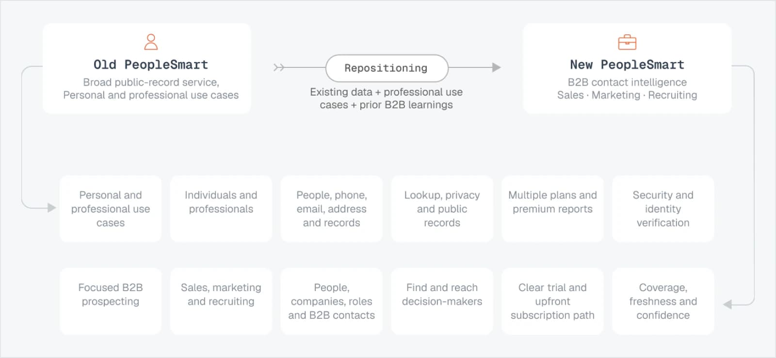
FRAMING THE PIVOT
LTV was already operating BeenVerified and PeopleLooker, so another people lookup service would have created overlap.
Instead, we used the company’s existing data and infrastructure to position PeopleSmart as an affordable B2B service for professionals who needed reliable contact information without enterprise-level cost or complexity.
THE CHALLENGE
Turn the already available contact & public-record data into a credible B2B offering.
A look at the shipped journey
Home page & search
Loading & report building flow
Upfront pricing
OUTCOMES

Fully shipped
Website and search experience

5+ years
visual direction remains largely intact

$20M+ ARR
Company-reported by Q4 2025
B2B AUDIENCE
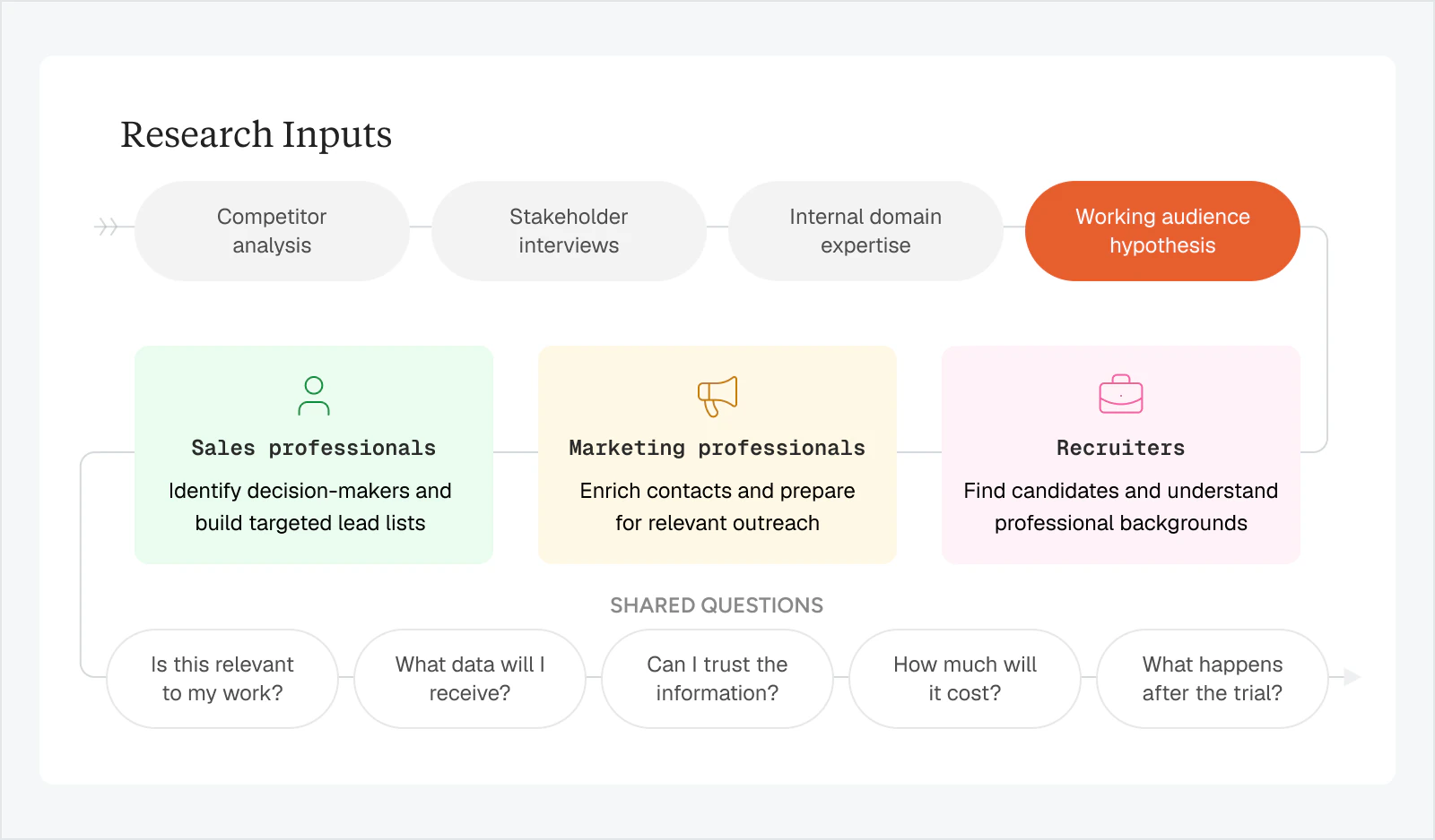
I used competitor analysis, stakeholder interviews and LTV’s experience with contact data to form hypotheses about sales, marketing and recruiting users.
These weren’t treated as validated personas, but they helped us decide what the website needed to explain, then test those assumptions after launch.
OLD EXPERIENCE
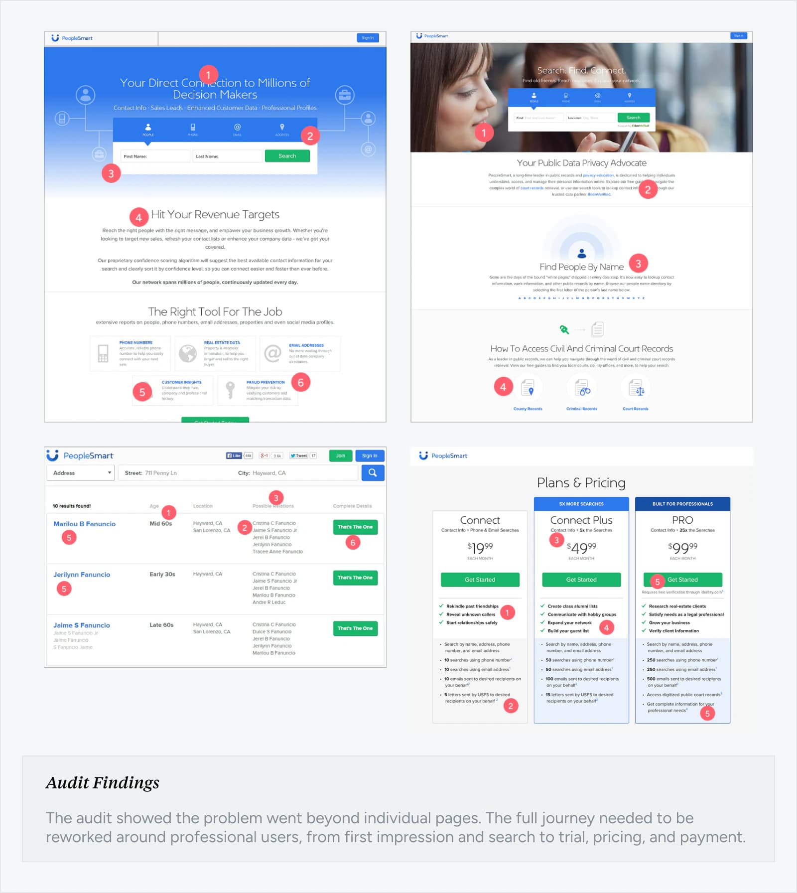
I audited the old website and search experience against our target audience.
PeopleSmart had strong search and data capabilities, but the experience mixed consumer, privacy, and professional messaging. It wasn’t clear who the product was for, what users would get, or why they should subscribe.
REDEFINING THE JOURNEY
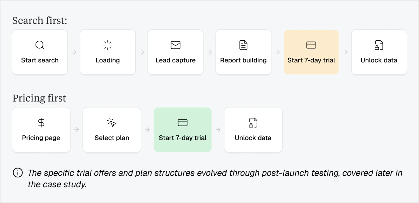
Instead of sending users straight to pricing, the search flow showed progress and built value before asking them to subscribe.
The redesigned journey carried the user’s original search through loading, lead capture and report building before showing the subscription page.
Search led visitors first experienced the value through their own query, while pricing first visitors began by comparing membership options. Both paths ultimately led to trial activation and data access..
NEW VISUAL DIRECTION
Giving the new direction a visual language
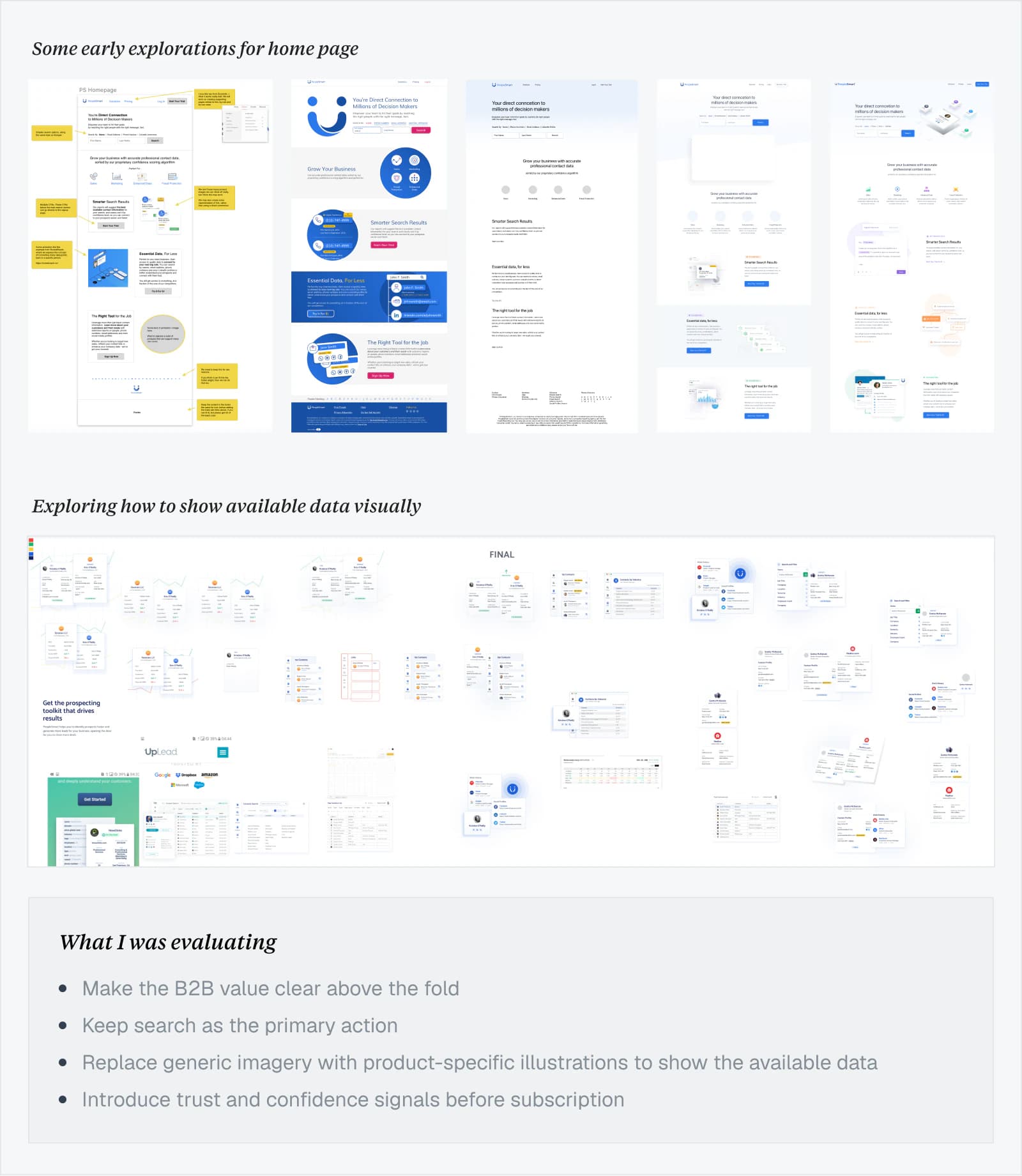
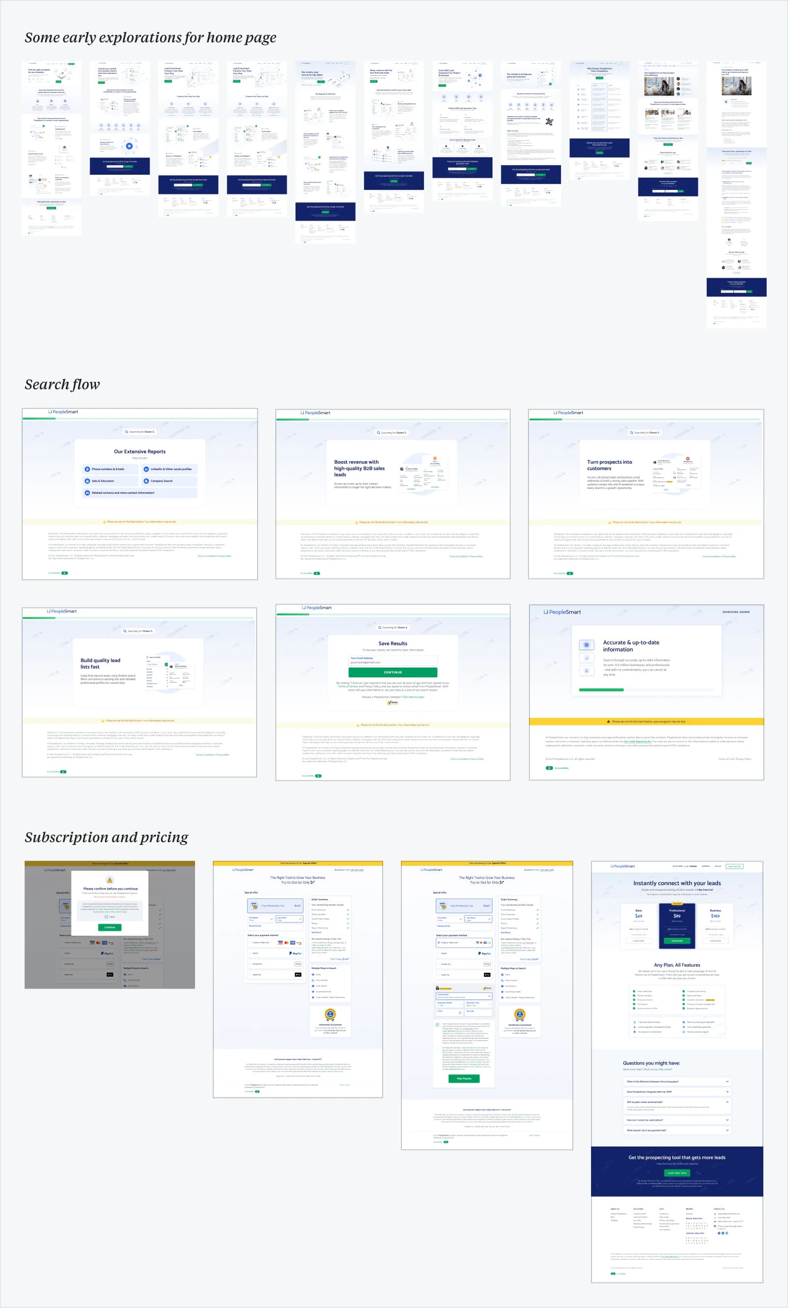
With the journey defined, I explored how PeopleSmart could feel credible and professional without adopting the complexity or impersonal tone of enterprise sales tools. Early homepage concepts helped compare different approaches to positioning, hierarchy, search prominence and visual storytelling.
HOME PAGE
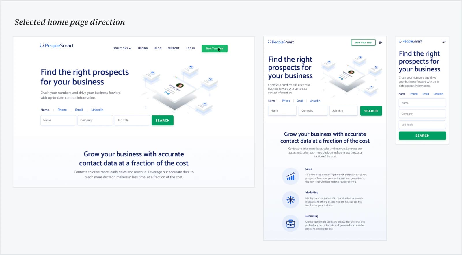
New homepage design brought the new B2B positioning and visual direction into one focused, search-first experience.
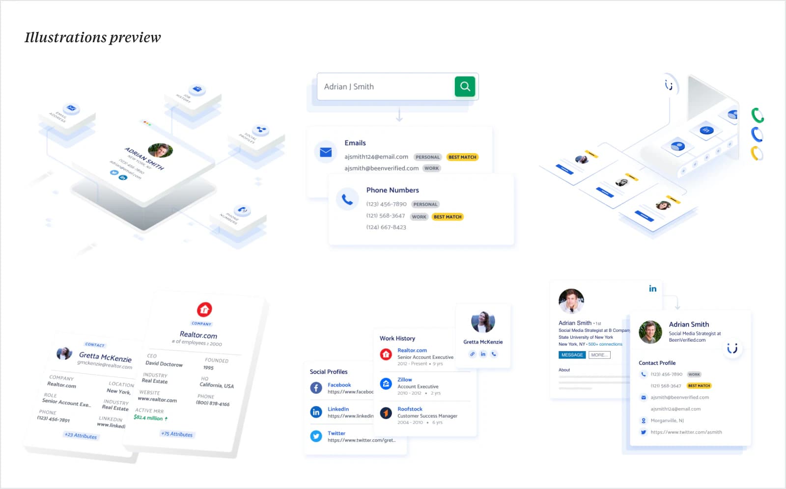
After several iterations, I chose a direction that made search the focal point while showing the value and breadth of the data around it.
Home page full view
DESIGN SYSTEM
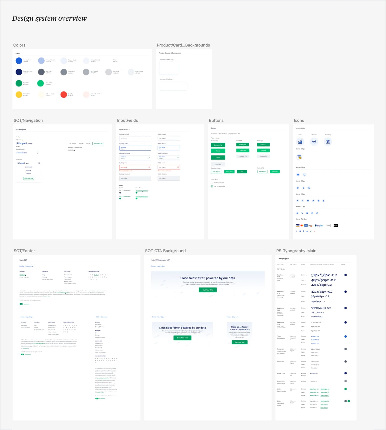
Building the shared design system
Once the visual direction was set, I built a shared design system to keep the website, search, lead capture, and subscription flows consistent.
SHIPPED JOURNEY
Finishing the remaining marketing pages and designing the search and subscription flows
After building the design system, I carried that same visual language across the brand. I worked closely with the product and engineering to bring it all to launch and made sure everything matches the specs.
TESTING AFTER LAUNCH
A/B tested the search and subscription flows to reduce drop-off and help more users reach subscription.
After shipping the initial redesign, we started running A/B tests on the search and subscription flows against live traffic to identify the friction and drop-off points. We tested different versions of each step in the flow in an effort to help more people to reach the next step and eventually subscribe.
When a version performed better, we made it the new control and started optimizing from there.
Because this work was completed in 2020–2021, I no longer have access to the original test dashboards. This case focuses on the designs, what I learned from each test and the decisions that followed rather than recreating exact numbers.
OPTIMIZING SEAERCH
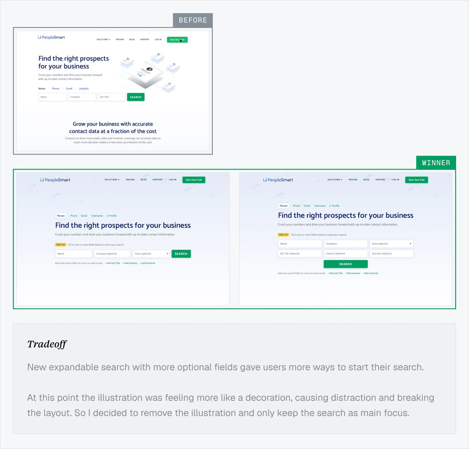
Made the search feature more flexible by adding optional search fields
As search needs grew more complex, I prioritized flexibility over decoration, keeping three core fields visible and replacing the hero illustration with optional fields users could reveal as needed.
LOADING PAGE
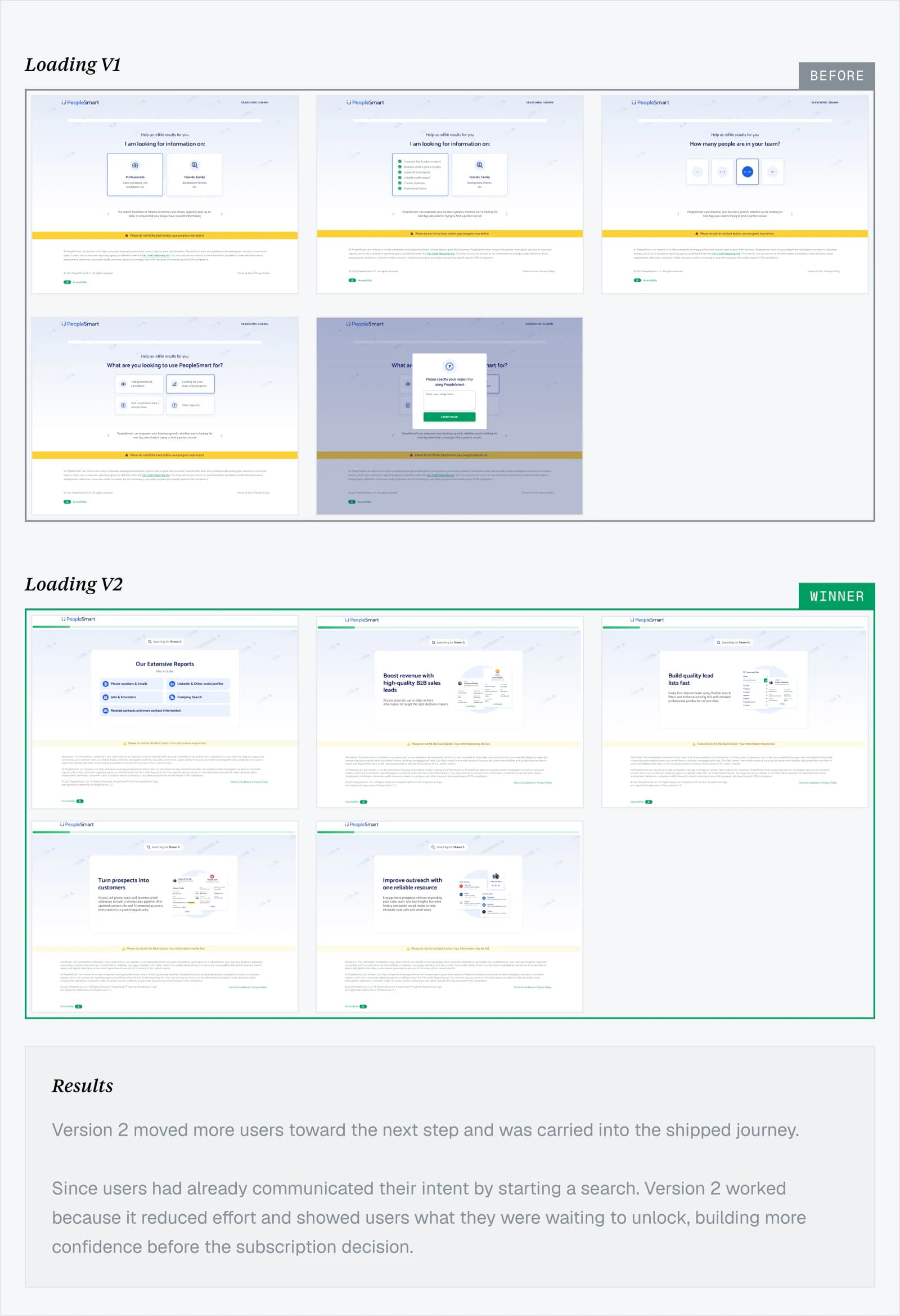
We tried to use the waiting period of loading page to gather some more user data and also educate them about the product offerings
Submitting a search introduced a short loading period before lead capture. We tested whether this time should collect additional audience information or demonstrate the value users were waiting for.
LEAD CAPTURE
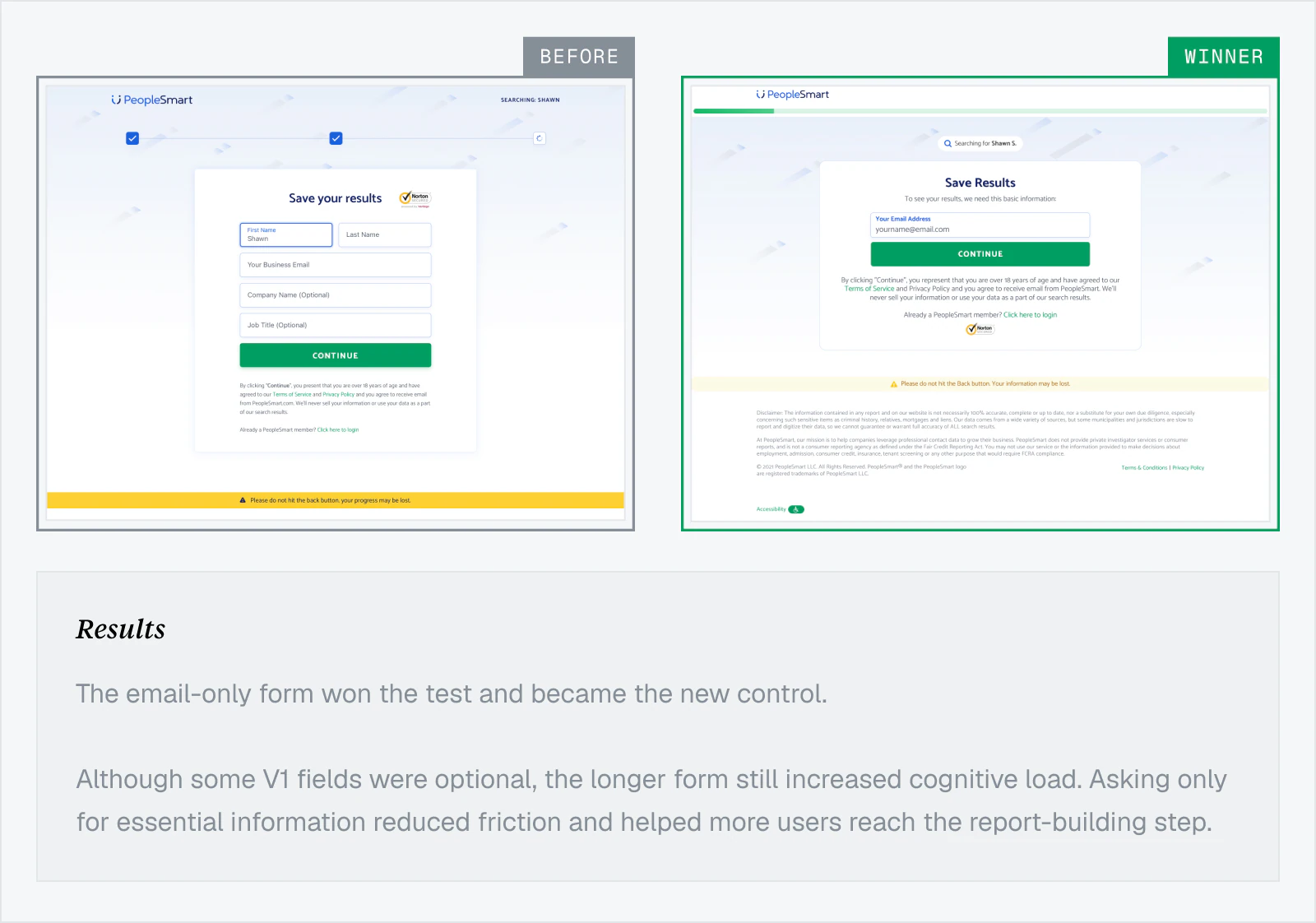
We tested the short vs long lead capture form to understand which one works better
After users invested time in a search, we tested how much information should be required to save their progress and move them to the next step comfortably.
1. Full lead form: Captured more data but added friction before users could continue.
2. Email only: Reduced the commitment to one clearly explained field.
REPORT BUILDING
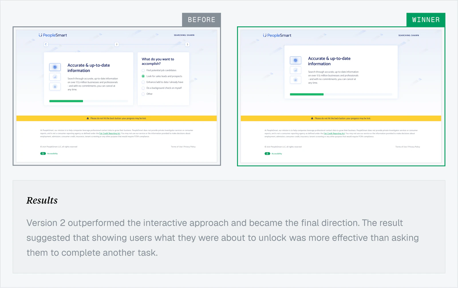
Testing the user engagement and collecting more data before showing the final report
We tested 2 variants where we asked the users goal-based questions to learn more about their use cases, and another variant simply showing the product value before sending them to payment page.
SUBSCRIBE
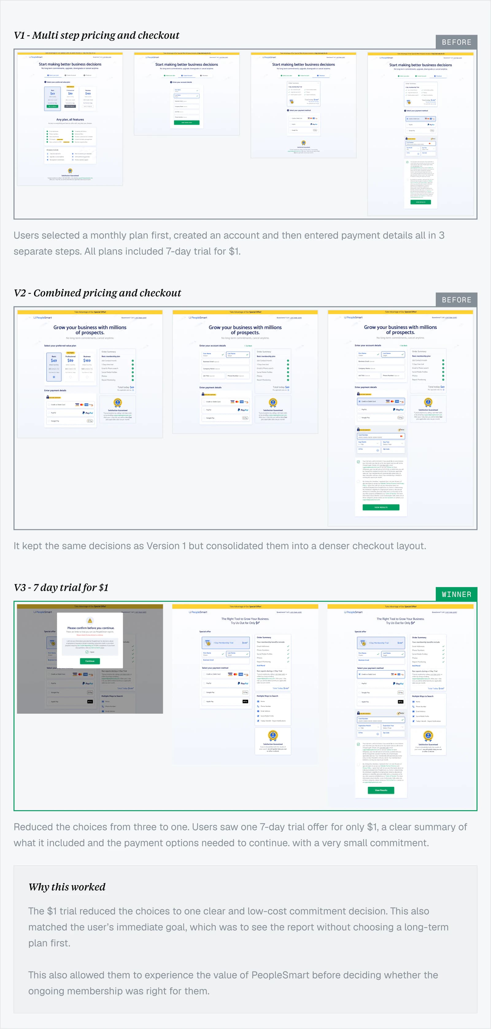
We tested whether users were ready to commit to upfront monthly plans or go for a smaller first commitment.
Two variants presented plans before a free or $1 trial; the third offered seven days for $1, followed by full billing unless canceled.
OUTCOMES
Fully shipped
Website and search experience
5+ years
visual direction remains largely intact
$20M+ ARR
Company-reported by Q4 2025
WHAT I LEARNED
This project taught me that better conversion often came from asking users to do less, fewer fields, fewer questions and smaller decisions at the right time.
It also reminded me not to get attached to visual ideas. Removing my illustration and simplifying the journey made the experience less decorative, but more useful. Most importantly, I learned that the same data needs a different story when the audience and intent change.